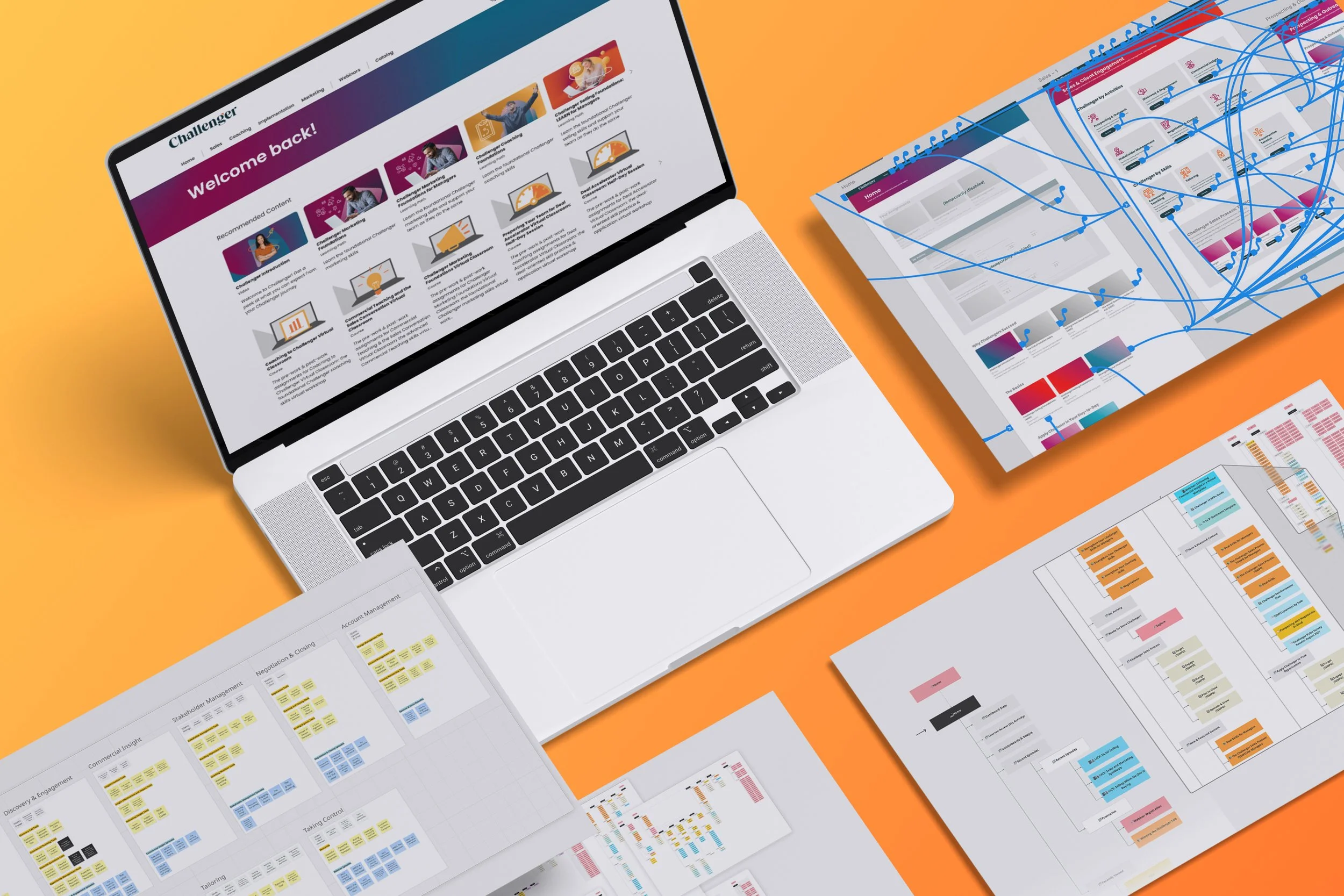
Challenger Hub
Information Architecture
Summary
I led an information architecture redesign of Challenger’s e-learning platform, the Hub, which served more than 350 client accounts. Feedback from sales enablement leaders, one of our core user groups, and a heuristic evaluation I ran showed that content was hard to find. I used a content audit, card sorts, prototypes, usability tests, and subject matter expert input to rebuild the sitemap. I also implemented the redesign myself. The changes improved client feedback and contributed to an 83% drop in support tickets.
Details
Company: Challenger Inc.
Role: Product Designer Timeline: Mar–Sept 2023
Skills: Information architecture, content audits, card sorting, usability tests, prototyping, change management, LMS management, instructional design
Tools: Miro, Adobe XD, Thought Industries (LMS), WalkMe
Context
The Hub served more than 70,000 learners across 350+ client accounts, including Fortune 500 companies such as Microsoft, Johnson & Johnson, Chevron, and Honeywell.
Although functional, the site was difficult to navigate and felt unwieldy to clients. Some asked to build customized versions to fill the gaps. One client that later churned said its sales reps gave up when they opened a playbook and saw a wall of links. Their training lead put it this way: “I was just begging to not drown through all of it, but prescribe the exact resource.”
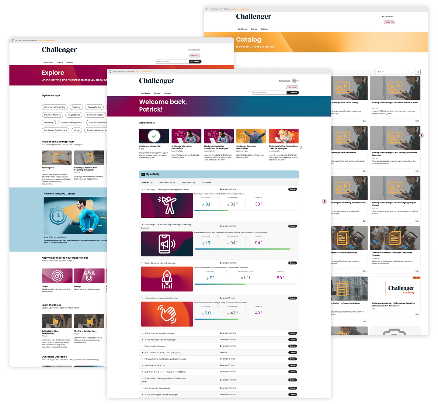
A heuristic evaluation I ran with three teammates also identified the information architecture as a major source of friction. I recognized that the core issue was findability and divided the work according to how people look for information: browsing and searching. This project focused on browsing; a separate initiative addressed search.
The Problem
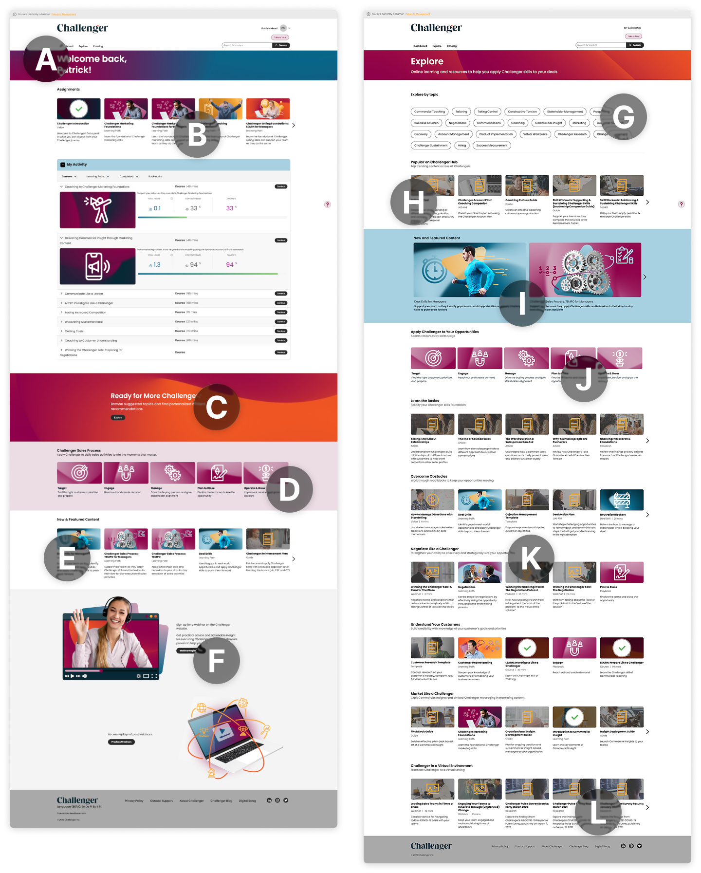
The site had three main pages: Dashboard, Explore, and Catalog. Each created problems for users.
The Dashboard had no metrics or progress indicators; it was mainly a starting point for content. Explore was a catch-all for topics that didn’t fit elsewhere. Users were expected to browse it for new content, but few did.
The Catalog was a dedicated search and filtering page, so I addressed it separately from this browsing-focused project.
Research & Discovery
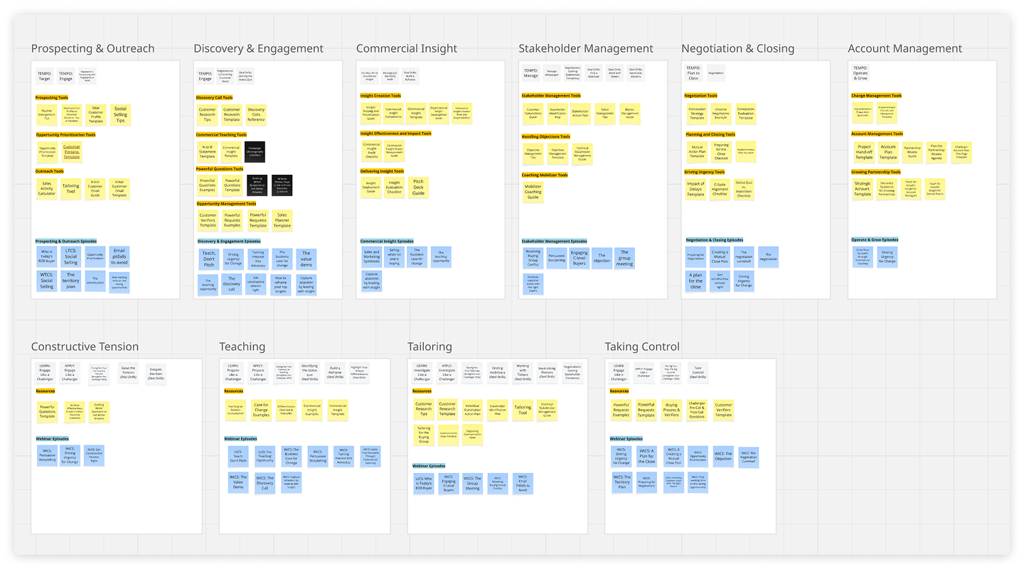
I began by auditing the sitemap and content library in Miro to understand what we had and how it connected. With our Senior Learning Designer, I separated core instructional content from work resources and identified gaps in the existing structure.
Then I ran a card sort in Miro with teammates to find natural ways to group the content. Participants tended to sort by role, skill, or stage in the sales process. Since the existing site had almost no role-based organization, I saw that as an opportunity to help people find relevant content more easily.
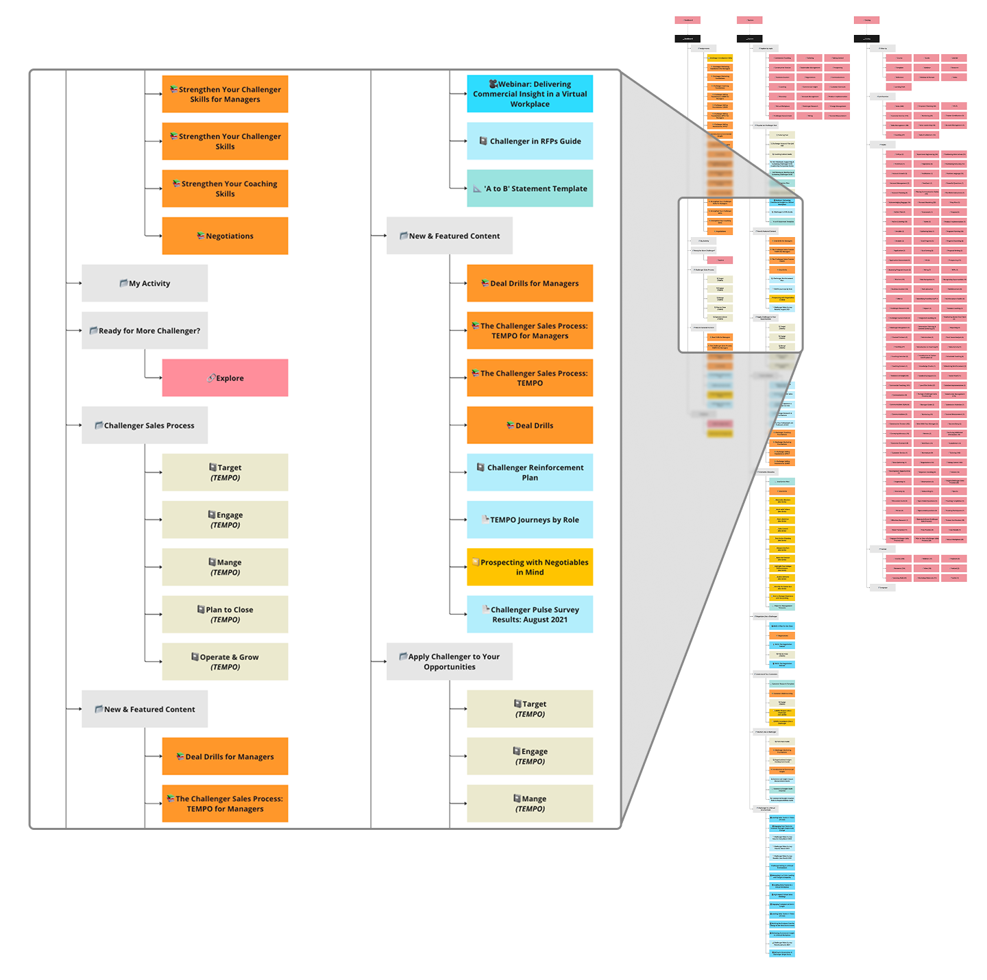
Initial content audit (Miro)
Process & Approach
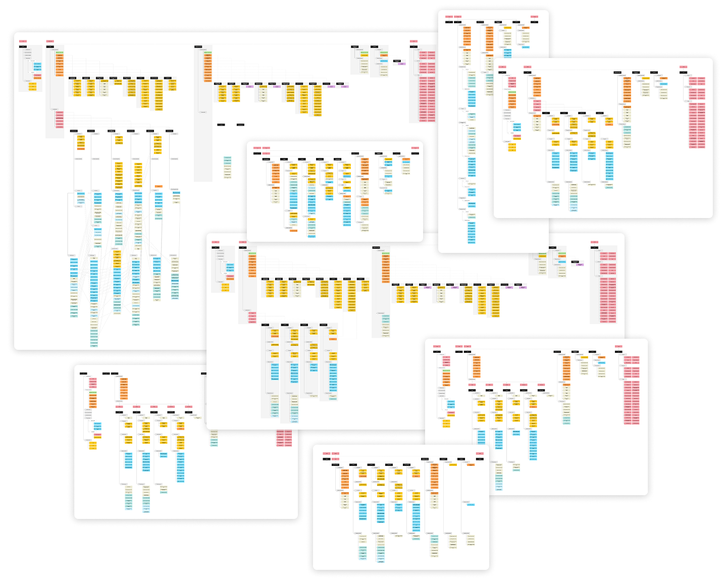
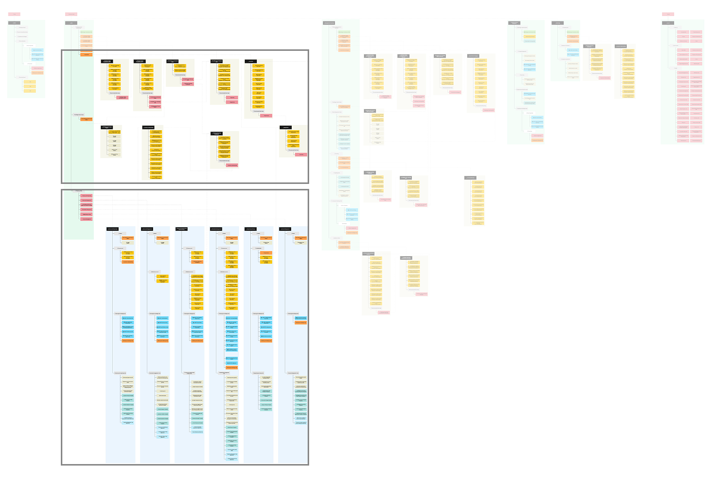
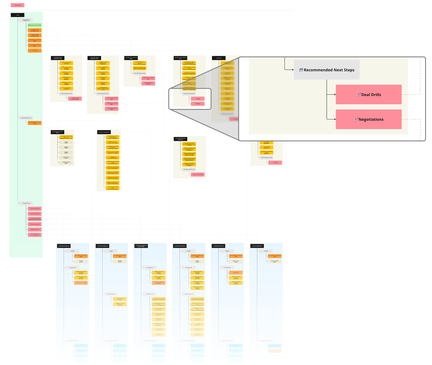
Using the research, I created competing sitemaps in Miro to test different organizing principles and cross-linking methods. I asked Learning Design and Product leadership to review them and choose an option to prototype.
Sitemap Iterations
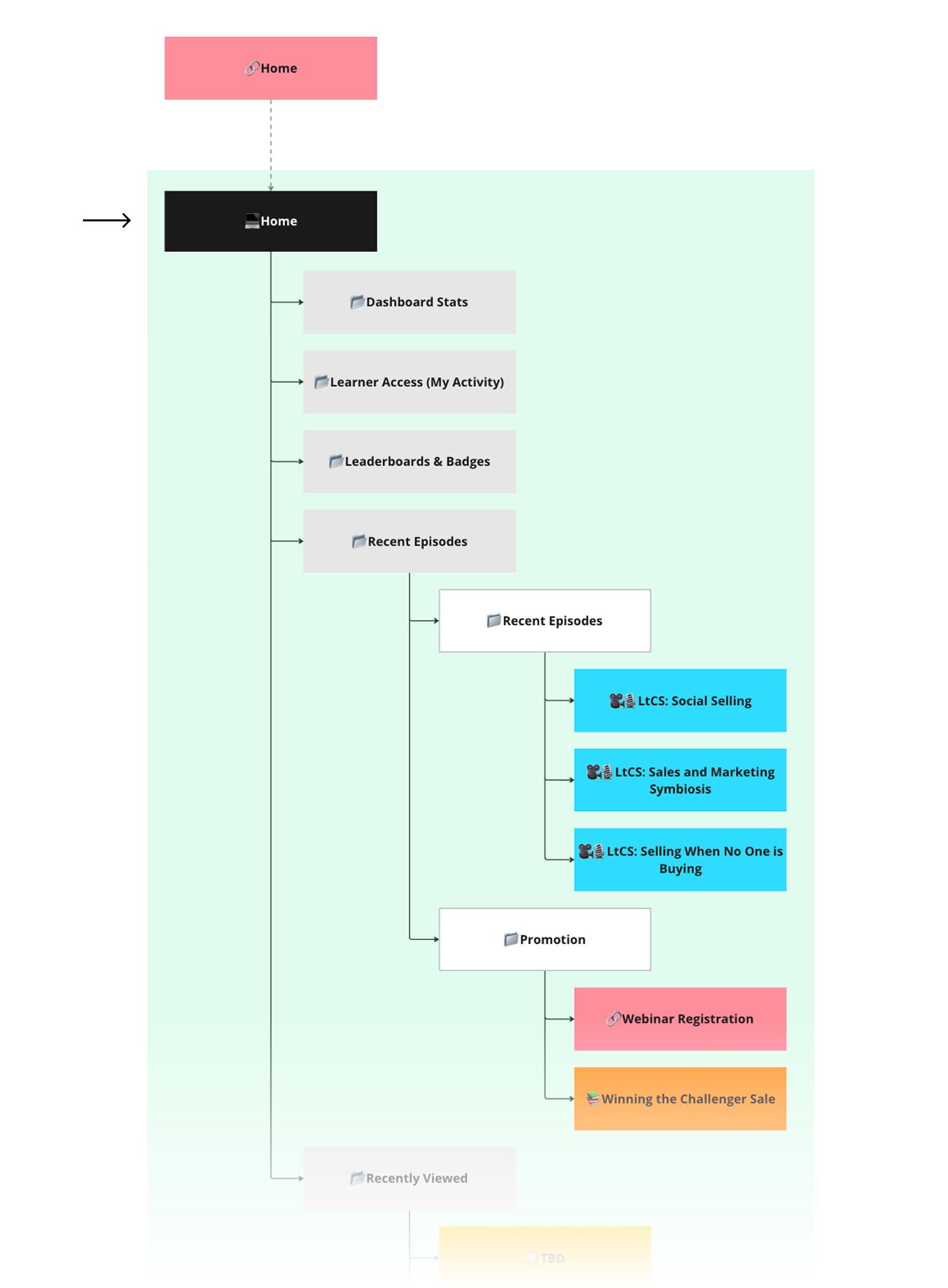
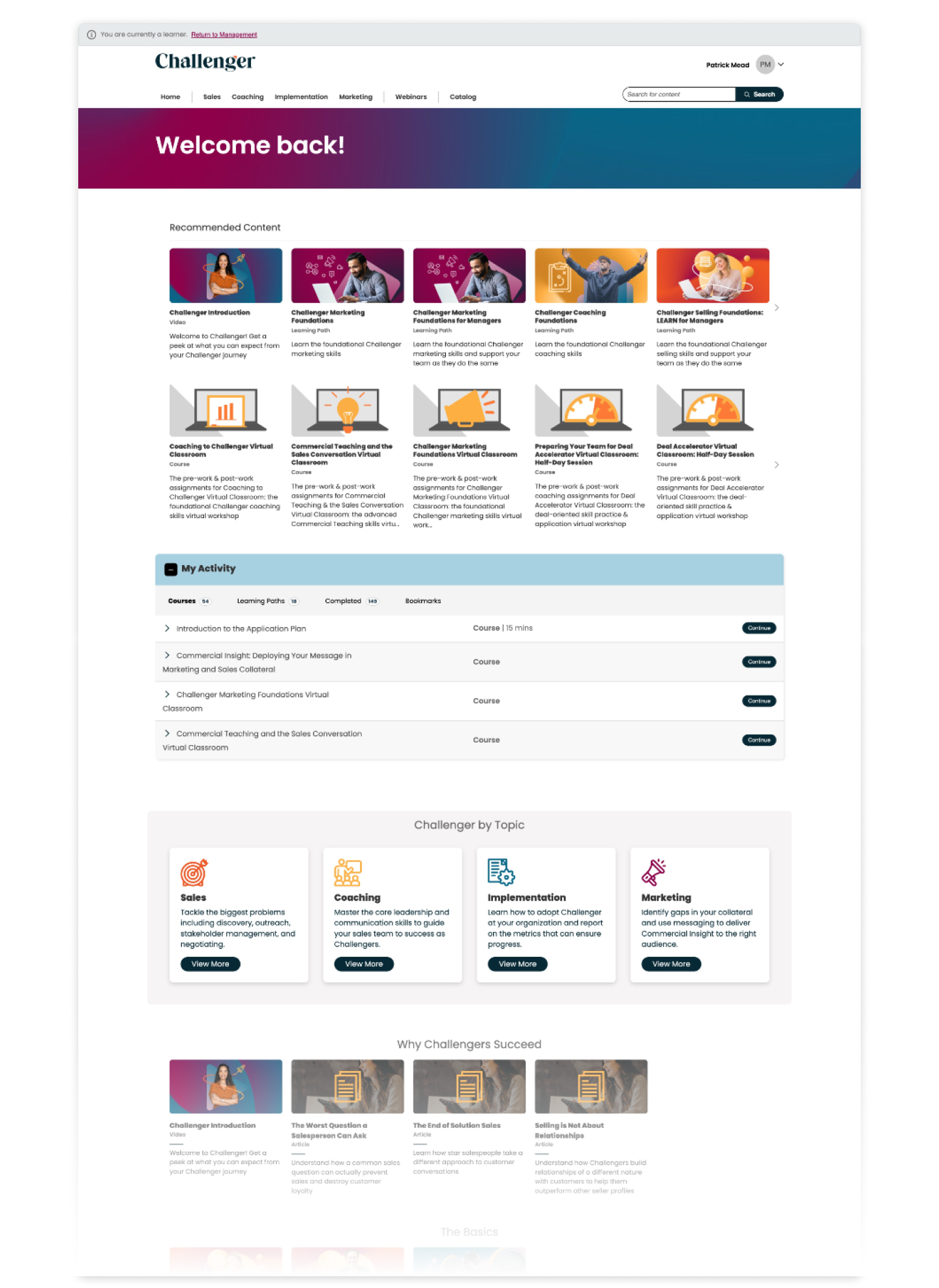
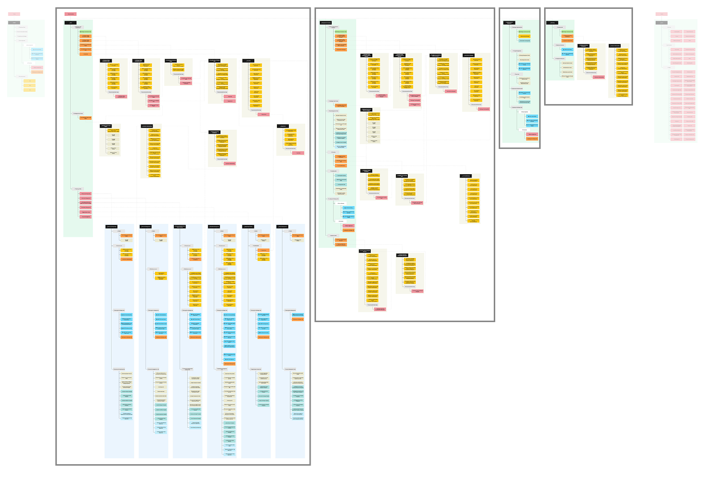
The redesign included several key changes:
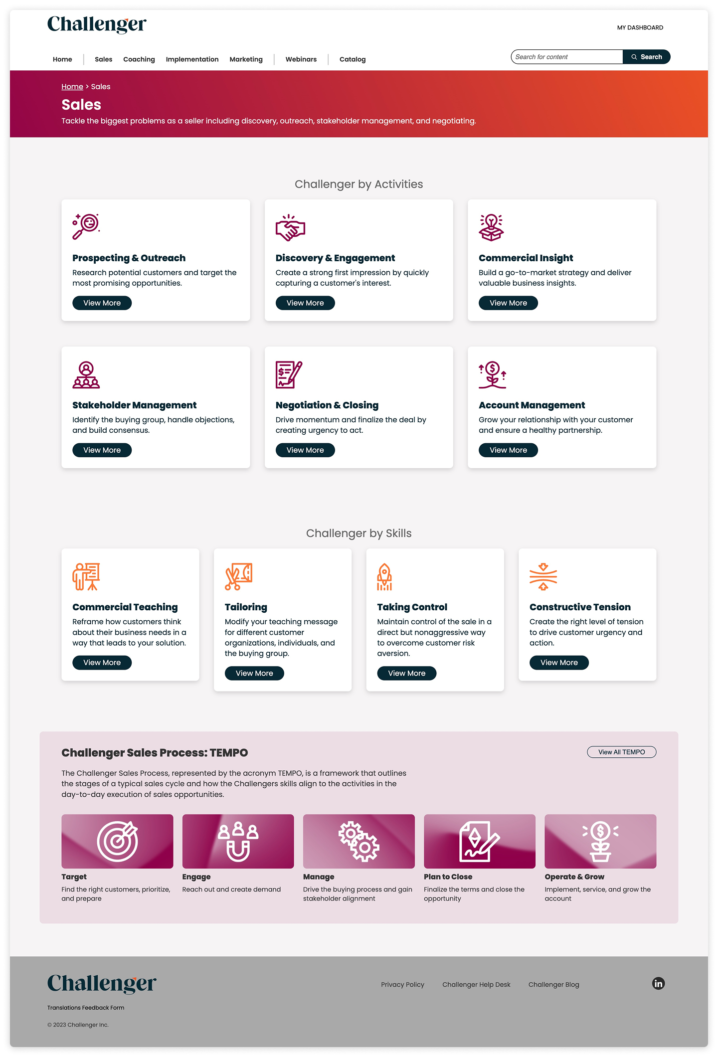
Dashboard became Home. “Dashboard” implied features the page didn’t offer.
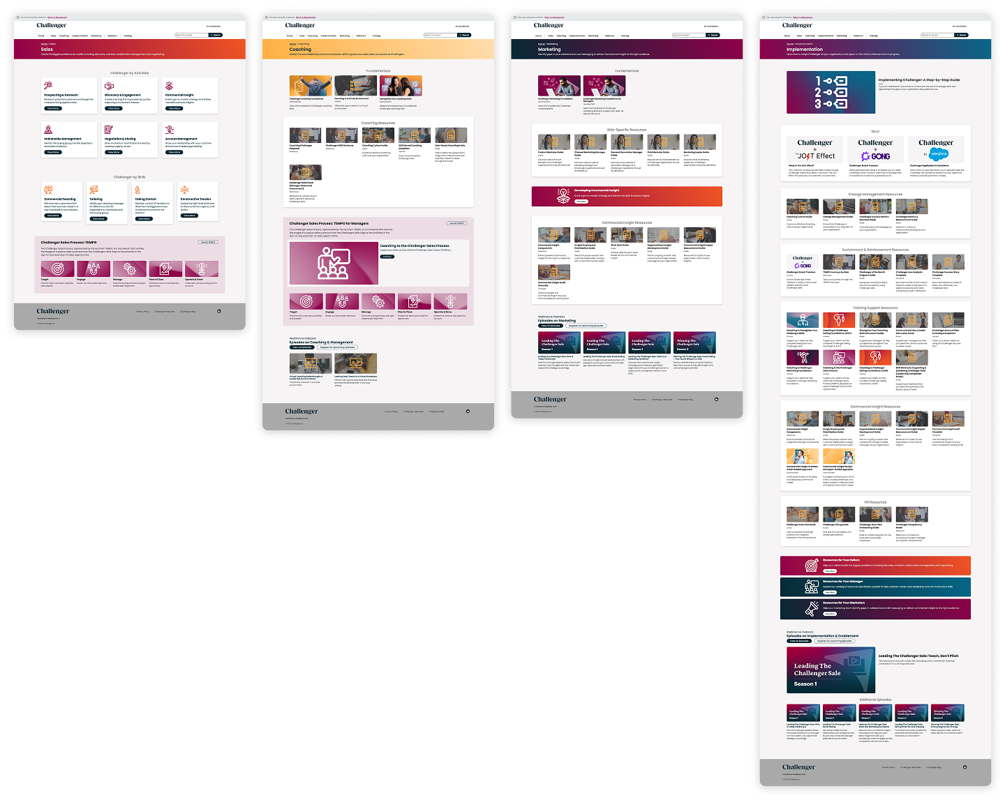
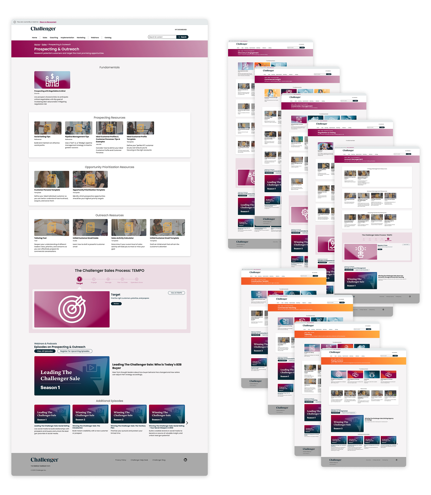
Role became the primary hierarchy. The navigation was split into Sales, Coaching, Marketing, and Implementation, helping enablement leaders find content for the teams they supported.
Webinars got their own navigation link. It’s a distinct content format that we wanted users to find easily.
Sales content was organized by both skill and sales stage. There was so much content that one organizing method didn’t seem sufficient. I included both so users could follow the path that best matched what they needed.
Each sales topic got its own page. These pages brought together relevant courses, learning paths, resources, and podcasts so enablement teams could see what was available on each subject.
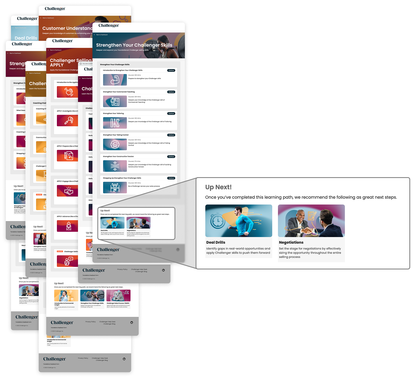
Key learning paths got an “Up Next” step. This recommended the next learning path and reduced dead ends.
The new sitemap made navigation more predictable, with each click bringing users closer to what they needed. It also showed the breadth of the content library and how its parts fit together.
Testing
I built functional prototypes in Adobe XD and ran several rounds of recorded usability tests with groups from Customer Success, Account Directors, Sales, and Product. Accessing a client for testing involved a lot of red tape, but I was able to run a session with one client as well.
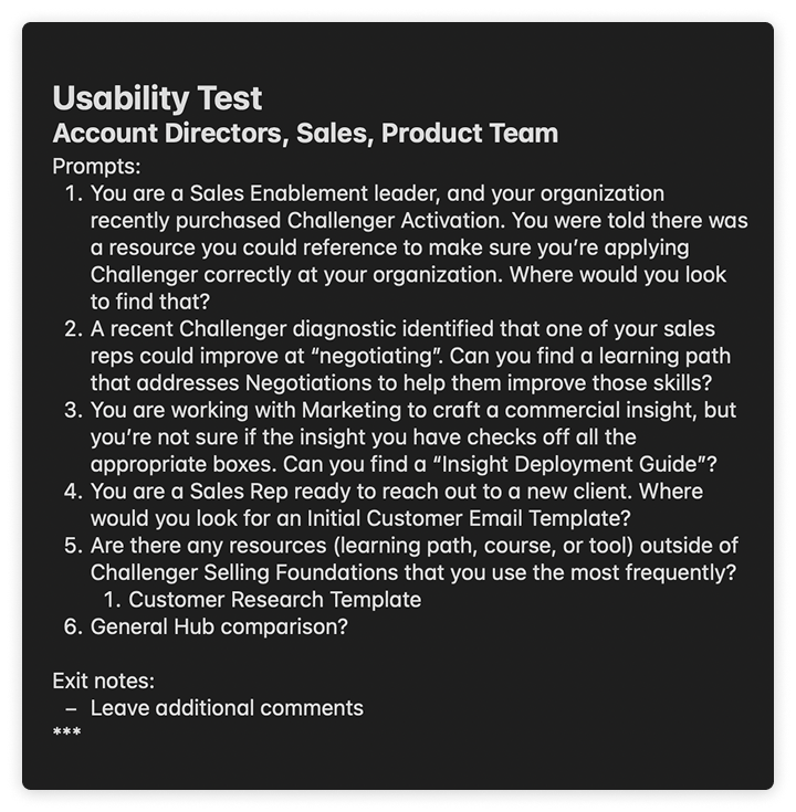
Participants shared their screens and worked through scenarios in the prototype, such as:
You’re a sales enablement leader whose company just bought Challenger Activation. Where would you find guidance on applying Challenger correctly?
A Challenger diagnostic showed that one of your reps needs to improve at negotiating. Find a learning path that could help.
You’re a sales rep about to contact a new client. Where would you find an initial customer email template?
Testing led to dozens of changes, including clearer labels, more relevant resources in key locations, and cross-links that helped users reach their goals even when they took an unexpected path.
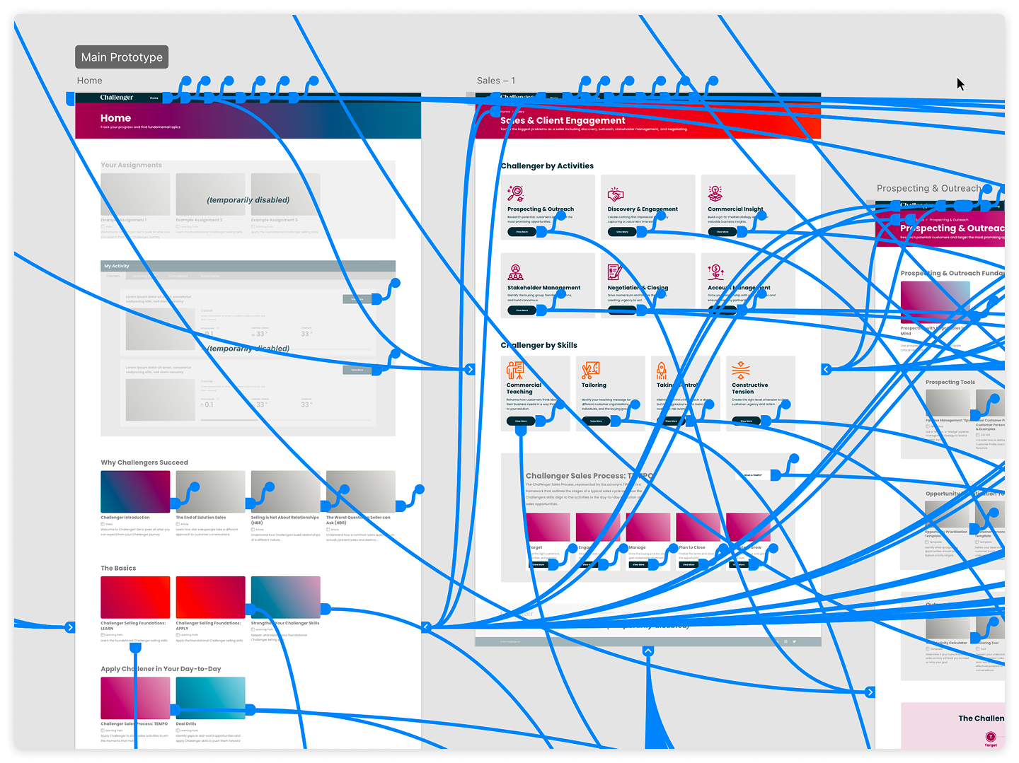
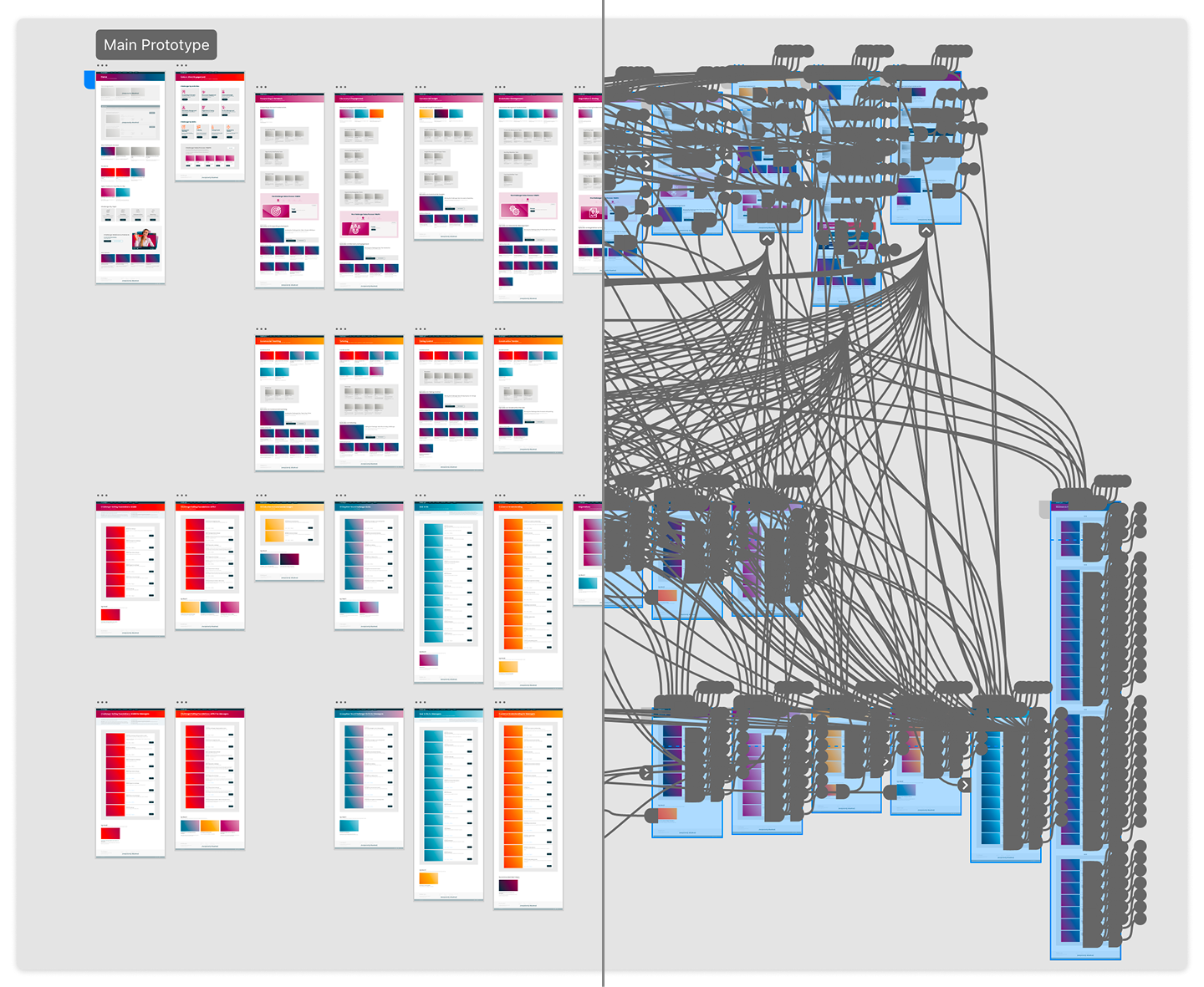
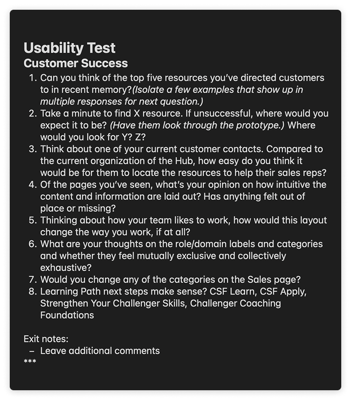
Once leadership agreed on the direction, I built the new structure in a sandbox for my teammates to QA. The design worked, but implementation presented a challenge: 96 of the 350+ client accounts had customized layouts that prevented them from receiving design updates.
I coordinated with Customer Success and Product to explain the benefits of the new experience and help those clients move off their custom setups. I confirmed that the changes wouldn’t affect access to content and that deep links and SCORM connections would keep working.
Before launch, I prepared release notes and answers to likely client questions. Our Product Marketing Manager used them to create an internal guide for Customer Success and Sales, noting: “These answers are so helpful and will empower client facing team members to get ahead of any client questions or concerns.”
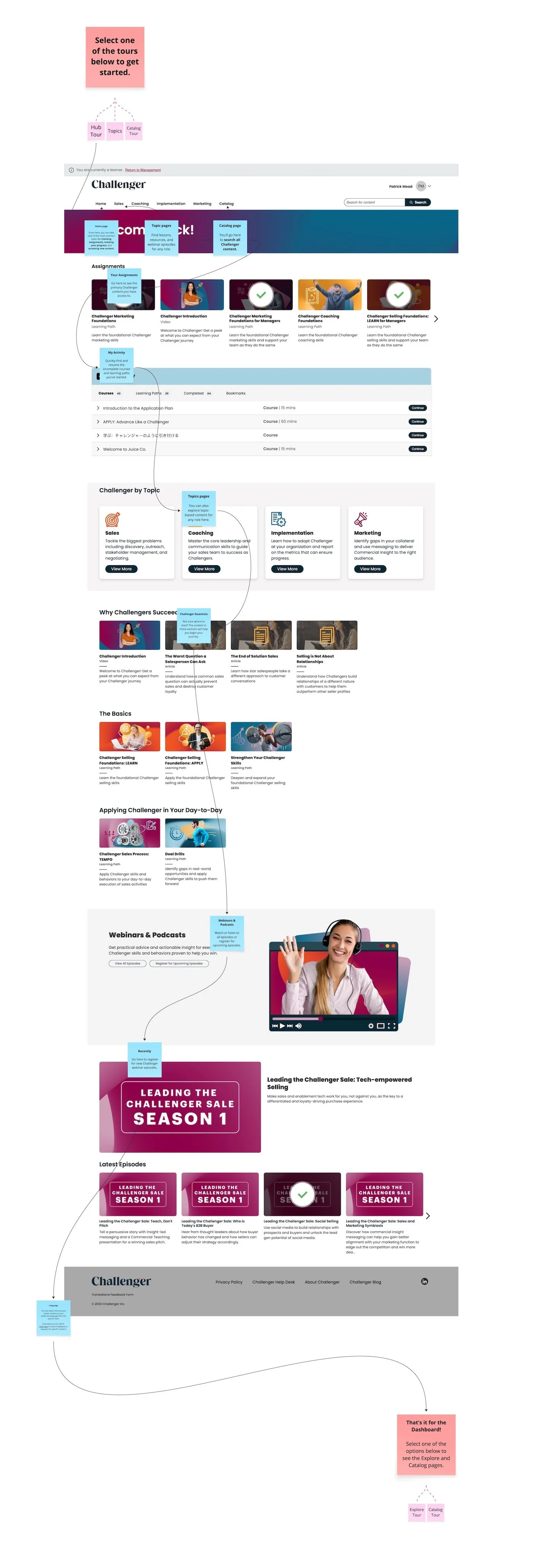
"Patrick has been hard at work for the past few months exploring the major pain points in navigating the Hub and preparing some great updates… As the result of a whole lot of listening, testing, changing, tweaking and more, those updates will be going live July 10th."
— Peter Moreno, then Group Product Manager, in the launch announcement
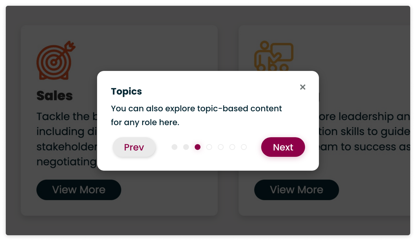
I handled the implementation, including page layouts, CSS updates, LMS restructuring, and content population. The phased rollout began on July 10, 2023, with role-based navigation for most clients. I also created in-product walkthroughs with WalkMe for first-time users.
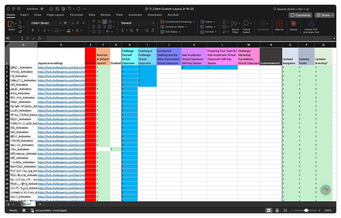
Through the end of September, I moved clients with custom layouts over one at a time, rebuilding each site in the new architecture and tracking progress in a spreadsheet. By mid-September, 79 had moved to the new layout.
Because I was often working around the platform’s limitations, I partnered with our LMS vendor, Thought Industries, to troubleshoot and find solutions when its defaults got in the way of a good user experience.
Impact
We saw improvements in support numbers and client conversations. With major navigation issues addressed, the information architecture redesign contributed to an 83% drop in Zendesk support tickets, from roughly 600 a year to about 100.
Within days of the initial launch, client-facing teams were sharing positive feedback from clients on project calls and by email. The changes helped rebuild client goodwill and showed that the product was moving forward.
"The Hub has gone [from] something our CSMs were hesitant to talk about or even learn to something that's more universally embraced as a key reinforcement driver for our learners…The changes to the Hub's experience are huge and have made a massive impact in confidence our customer-facing teams have in speaking to it — most of which have been driven and executed by Patrick."
— Gina Slesar, then VP, Product
Reflection
There was little existing data on user click paths, so I relied on research and testing to shape the redesign. Because the update affected nearly every client and our largest digital product, some cautious pushback was understandable. Sharing findings at each stage—from card sorts to usability tests—helped me get support across departments.
Some decisions involved trade-offs. Platform limitations meant clients could see little or no content on certain pages, depending on their licenses. We knew about this going in and chose the clearer structure anyway.
Support for the project varied, but after launch the work was broadly appreciated across the company. Looking back, I could have involved more people from other departments by asking for less of their time, more often. Busy people are more likely to make time for smaller, frequent requests than for long meetings.