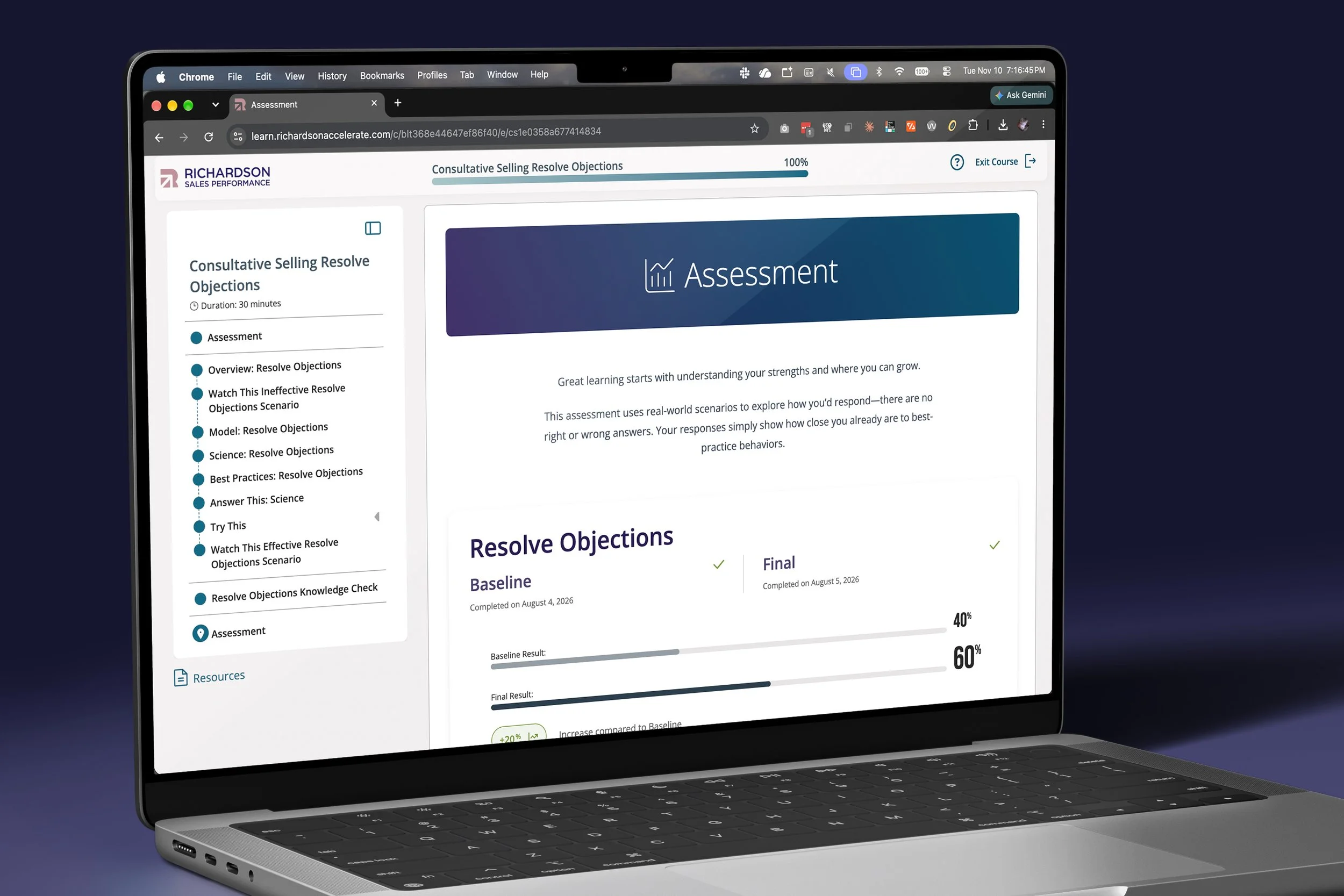
Richardson’s Prism
e-Learning
Summary
When Richardson acquired Challenger in 2024, both companies retired their flagship e-learning platforms. I designed the course experience to replace them, taking over from an outside vendor whose work wasn’t meeting our design and timeline needs. As the project’s only product designer, I created the design system and course UI, and led the design of every learning module. Developers build directly from my specifications.
I made accessibility a requirement for every component and gave learning designers a flexible system for building courses. Learn Phase 1 was ready for customer deployment in August 2026, and I continue to refine it through regular audits of the live product.
Details
Company: Richardson Sales Performance
Role: Product Designer
Timeline: 2025–present; Phase 1 ready for customer deployment in August 2026
Skills: UX/UI design, interaction design, prototyping, design systems and documentation, accessibility (WCAG)
Tools: Figma, Adobe XD, Miro, FigJam, Zeroheight, Jira, Contentstack
Context
Richardson Sales Performance acquired Challenger Inc. in 2024. Each company had a flagship e-learning platform with an international client base: Richardson’s Accelerate and Challenger’s Hub. After considering the options, the newly merged Product team and executive leadership decided to retire both platforms and build a new one from the ground up on a headless CMS.
The new platform had to host content from both companies, work within technical limits, and meet an aggressive timeline. Building from scratch gave me the opportunity to address known problems in both legacy platforms and include accessibility from the start.
An outside vendor was designing the course pages while I worked on the content blocks that would fill them. I asked my manager, CJ Witherow, how I could get more involved in the larger project. Britt Fortese, our Director of Digital Products, brought me in when the vendor wasn’t making enough progress and asked me to take on the overall course design as well as the learning modules.
The Problem
The vendor’s designs didn’t meet the established acceptance criteria. Menus were unclear, interaction states were hard to understand, and some designs failed WCAG accessibility standards.
I needed to design a working course page, including menus and navigation, as soon as possible. To keep development moving, I had to deliver individual elements and modules before I knew exactly how they would fit together. That meant some iteration would be needed later.
Our post-acquisition branding also wasn’t finalized, so the color themes I was building might need significant changes. The two companies had created content in many different ways, so I needed to simplify each module, menu, and element enough to work with varied content. Each component had to support many use cases while still making sections easy to distinguish.
In July 2025, a company-wide layoff eliminated the role of Nelida, the graphic designer I managed. I took on her workload alongside product design, including course graphics for the Challenger content migration.
Research & Discovery
I started with accessibility. I researched current WCAG standards and added accessibility requirements to every new component based on a user story. I also reviewed Apple’s Human Interface Guidelines and applied relevant standards to make components clear and predictable.
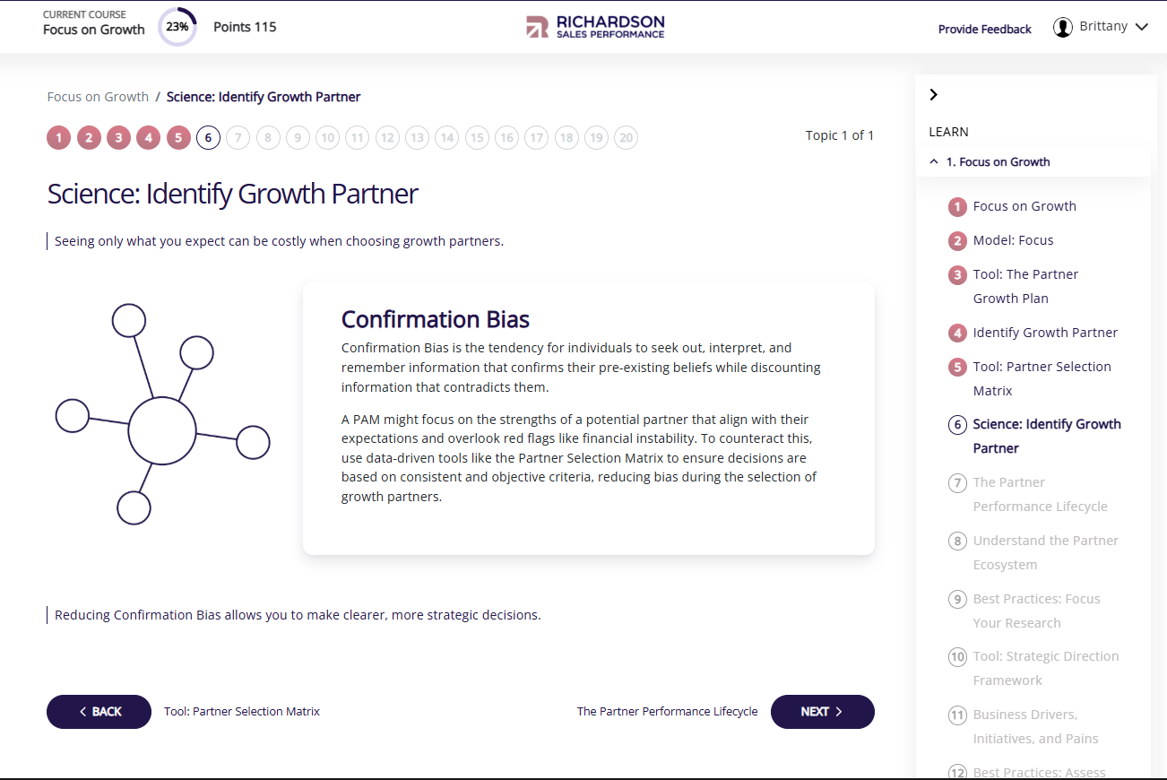
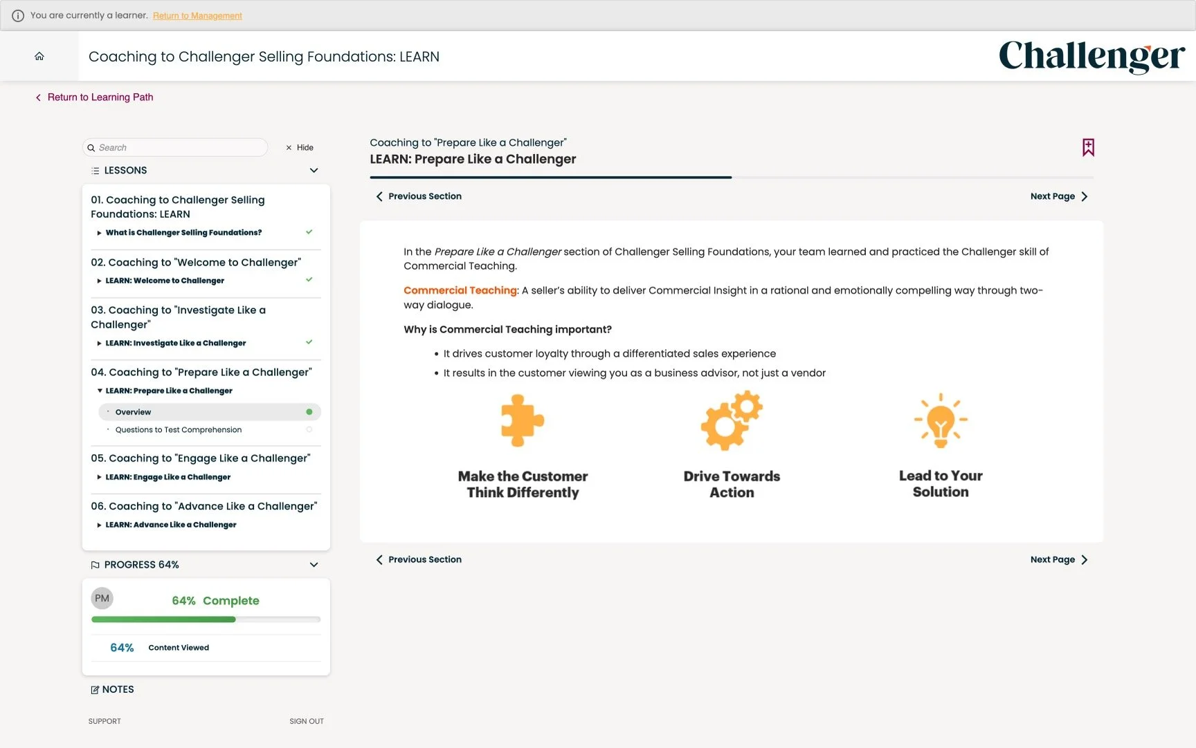
Then I audited both legacy platforms, documenting their content structures, design inconsistencies, user flow issues, and feedback. Accelerate had confusing, intermittent progress indicators, unconventional menus, arbitrary-looking layouts, and little visual hierarchy. The Hub ran on the Thought Industries LMS, whose limitations led to overlapping menus and clunky interactions; its progress indicators were also confusing. I reviewed the vendor’s work to identify anything worth keeping.
I also studied how leading e-learning platforms, including LinkedIn Learning, Skillshare, Brilliant, and Coursera, structure their courses visually and conceptually.
This research led me to focus on an intentional content area with fewer distractions and a clear, predictable visual hierarchy. Much of the existing acceptance criteria lacked documentation, so I worked with Britt to define a purpose and user story for every new function and component.
Legacy Richardson Learn
Legacy Challenger Hub
Process & Approach
Navigation and the course container
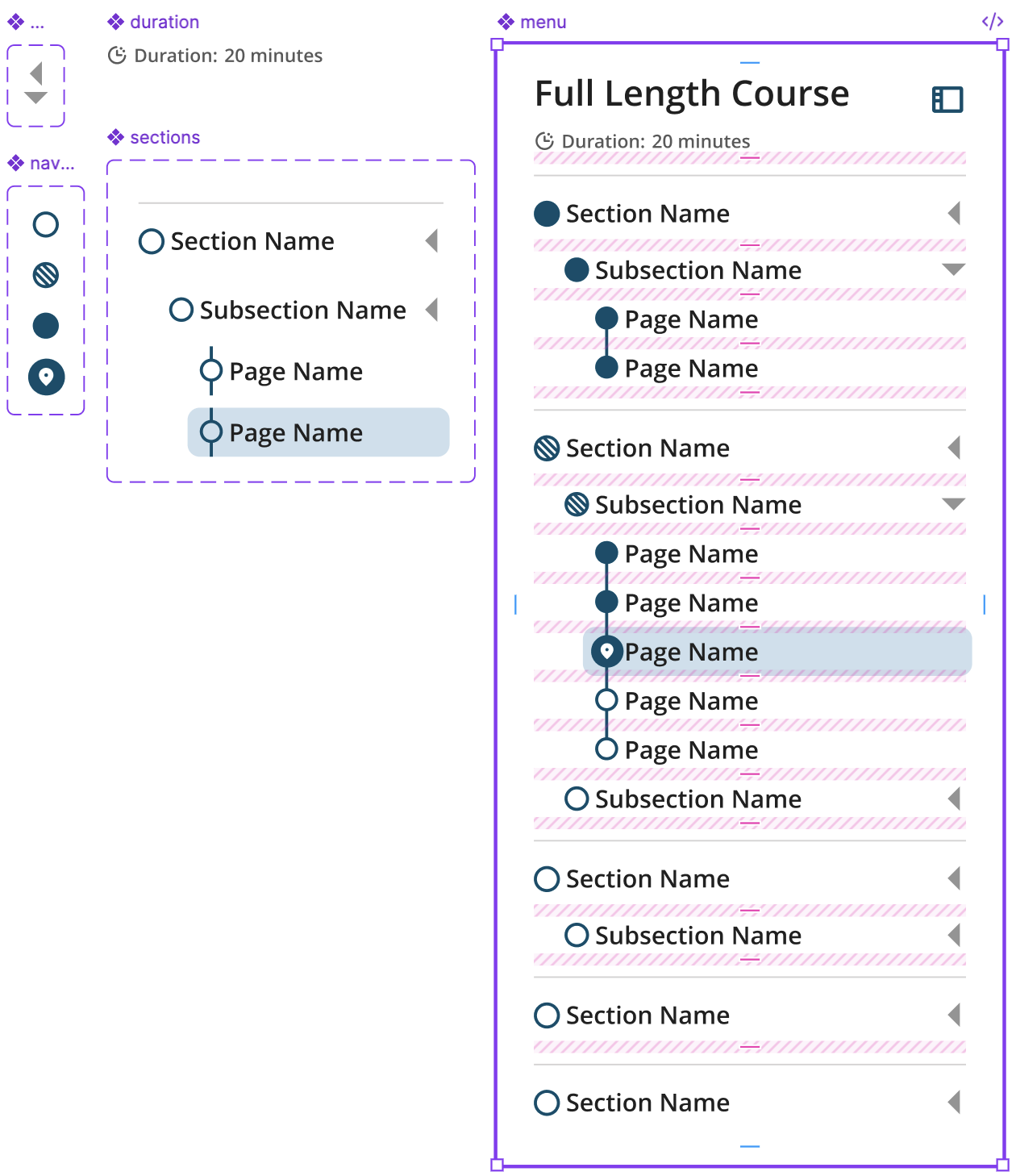
I built wireframes from the acceptance criteria, then worked with Britt on navigation, progress tracking, and content presentation. The course container brings together the course menus, which serve as the main navigation and show learners the course structure, along with progress indicators, page navigation, and global UI. I grouped related actions and used animation cues to make interactions clear and intuitive.
Britt wrote the development specifications based on my navigation and page designs, which set the pace for the build. She also used my navigation designs to brief Kate Lewis, our Chief Product Officer, on the product’s direction.
Learning modules
I designed the full library of learning modules used by our learning designers: flip cards, click-to-reveal, accordions, tabs, slideshows, and assessments, including all their states. Assessments covered multiple choice, true/false, quiz, and practice questions, along with results views. I also designed the learning resources and course completion pages.
At first, I designed everything myself. As the workload grew, Nelida helped develop the core designs. We split up early Adobe XD wireframes for some modules, and she handled responsive states for modules I’d already designed. After her role was cut, I took the work back on, turning the wireframes into high-fidelity designs and creating all later prototypes and the Figma design system. I’ve since redesigned or reformatted virtually every module.
The design system
I created the first design system at either company to guide the course experience. It runs almost entirely on variables, from semantic design tokens to components and learning modules. I replaced fixed pixel sizes with relative units tied to text size so components and images scale across devices. I also defined content container widths (narrow, default, wide, and full screen) and internal breakpoints.
The system sets the build specifications for everything developers create on the platform. Developers, product managers, and learning designers all use it.
Working across teams
Product design had a standing place in refinement sessions with product management, content design, and learning design. The team reviewed and approved designs before development. As the work grew, the learning design team joined my design meetings with Britt so both sides of the newly merged company could coordinate their needs. For about fifteen months, Product’s monthly reports to leadership named me as the owner of Learn design work, alongside Britt.
I was also one of five owners of the Challenger content migration. Many original course graphics were locked inside old Storyline files, so I redesigned branded graphics and data visualizations for courses such as Negotiations. Design clean-up and QA was a formal stage of the migration, covering layout, styling, branding, and alt text for every visual. Nine courses went through that process.
Iterating on the system
The first version of the system lived in Adobe XD, with documentation in a separate Zeroheight site. It supported initial development and received positive feedback, but keeping the two tools in sync became difficult, especially after Nelida’s role was cut. I moved the system to Figma to get designs to developers faster and rebuilt the component library in a week. Figma has since replaced Zeroheight, and variables have made the system more scalable, cohesive, and complete.
Updated menu components and side nav
Launch
Before release, we beta tested the experience with 11 clients. Learners surfaced UX issues, including one case where a learner answered two questions correctly but was marked as having missed one. We fixed these issues before the wider rollout.
A July 2026 release included several design updates. In response to client concerns about translation quality, I designed a notice explaining that course text is machine translated and linking to a feedback form. The release also made the course header static and centered for a more finished look, and fixed a sequencing issue so learners reach 100% progress before the completion page.
In August 2026, Learn Phase 1 was declared complete and ready for customer deployments. New enrollments in Accelerate stopped. We had delivered the essential features needed to move customers without disrupting their experience, but had to defer some early work. Design and development would continue.
Since July 2026, I’ve run three audits of the live experience, combining manual reviews with AI agents that crawl courses for issues. Each audit checks accessibility, alignment, styling, and animation. I log each finding with its location, issue type, severity, and likely owner. The audits have generated 39 tickets in our UI refinement Jira project, including fixes to default settings in third-party components such as the PDF viewer and video player. The PDF viewer redesign, one of my first findings, is now in development.
Impact
Content from both companies now runs on one platform, and both legacy platforms are being retired. Prism Learn is built to serve the 5,000–10,000 learners a month moving over from them. It uses clearer patterns for navigation, progress, and content, and the system lets us ship functionality and fixes almost every day.
During beta, in-course feedback averaged 85–92 out of 100 across courses. One client’s deliveries in the new experience scored 7 NPS points and 1 point higher on content clarity than the course’s 2026 baseline. Learners also shared comments such as “Digging the layout and progression of Challenger Sales Approach” and “Simple, step by step, actionable takeaways!!”
We now meet WCAG requirements for color contrast and text size. As the only product designer, I’ve had to prioritize the work. Screen reader support and keyboard navigation are documented but not yet built; Britt asked me to hold those items until we have the bandwidth to address them properly.
"...clean, professional, and genuinely learner-friendly."
— Britt Fortese, Director, Digital Products
Reflection
I was learning much of this as I went. If I did it again, I’d move to Figma sooner. I stayed with Adobe XD because it was included in our license and was the tool I knew best. I hesitated because switching would take time, but the move solved nearly everything.
I’m proud of how the system is set up, with clear labels and files that are easy to navigate so others can update them without needing me to walk them through it. It isn’t perfect, and I’ve learned not to worry as much about whether every style has a variable or every dimension divides evenly. The timeline required us to move quickly and ship what developers needed, even when it was “good enough.” That’s been useful practice in letting go of perfectionism.
Next time, I’d push to define success metrics before launch. We didn’t set formal metrics for this program, so we don’t have completion or engagement data to show how the design performed. Establishing them at the start would give us concrete data to compare with the next phase.