TalkingParents Rebranding
Project Details
TalkingParents is one of the most used co-parenting apps globally, with more than a quarter of a million active users. As the company was preparing for a significant feature release, the owners wanted to explore a rebrand and website redesign to improve customer experience and brand perception.
As the project manager for the marketing and design teams, I helped craft the new brand messaging and guided the process that led to the updated visual identity. I also took the initiative to fulfill important UX roles missing from previous site updates, collaborating with the front-end development team to ensure proper implementation throughout.
My Contributions
Project Management
UX Design
User Research
Data Analysis
Information Architecture Design
Art Direction
Copywriting
Tools Used
Trello
Excel
OneNote

User Research
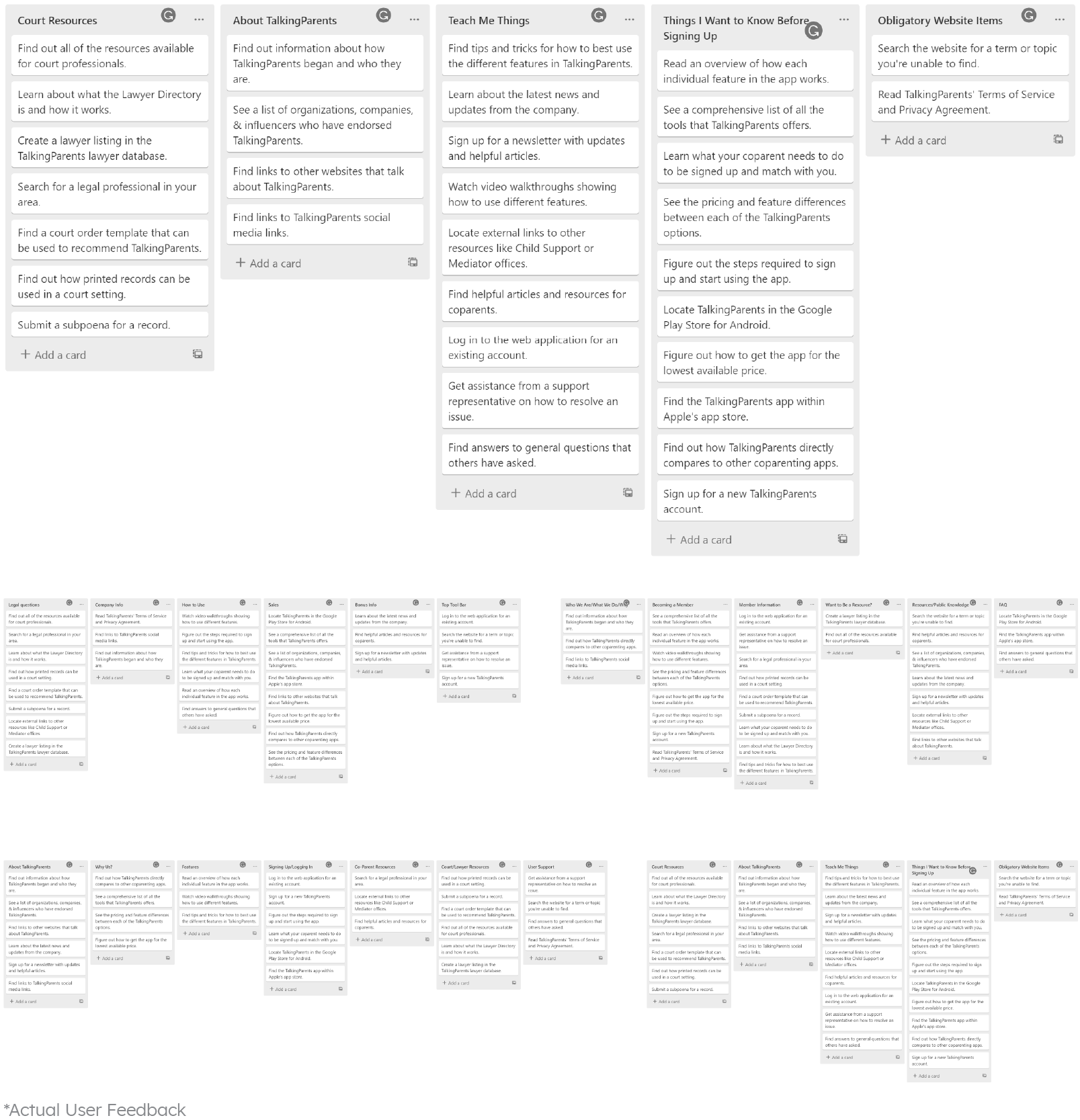
Our team needed multiple forms of reliable data before developing any wireframes or designs. I first gathered qualitative data by auditing user reviews on the Apple and Android platforms and various social media accounts. This information helped isolate some of the challenges that our team would need to overcome, such as perception and clarity issues.
I then compiled a list of user stories with all available actions to complete on the website for quantitative data. Once I developed these user stories, I performed a series of "open" card sorting exercises with test groups. Participants were able to organize and categorize the cards in whatever way they thought made sense.

Data Analysis
I aggregated and consolidated all card sorting data into spreadsheets to identify the trends. The organizational data revealed that the current website navigation was not meeting user expectations. Likewise, the section names users generated during the tests were then used to inform the final site nomenclature.

Challenges and Insights
The user research and subsequent analysis highlighted several key challenges that our team needed to address.
Perception
Because TalkingParents is sometimes court-ordered to co-parents in hostile relationships, there was a persistent misconception that it was a government-owned entity. In reality, the app was founded by parents and co-parents familiar with family law who wanted to provide a resource to improve co-parents' lives.
Personality
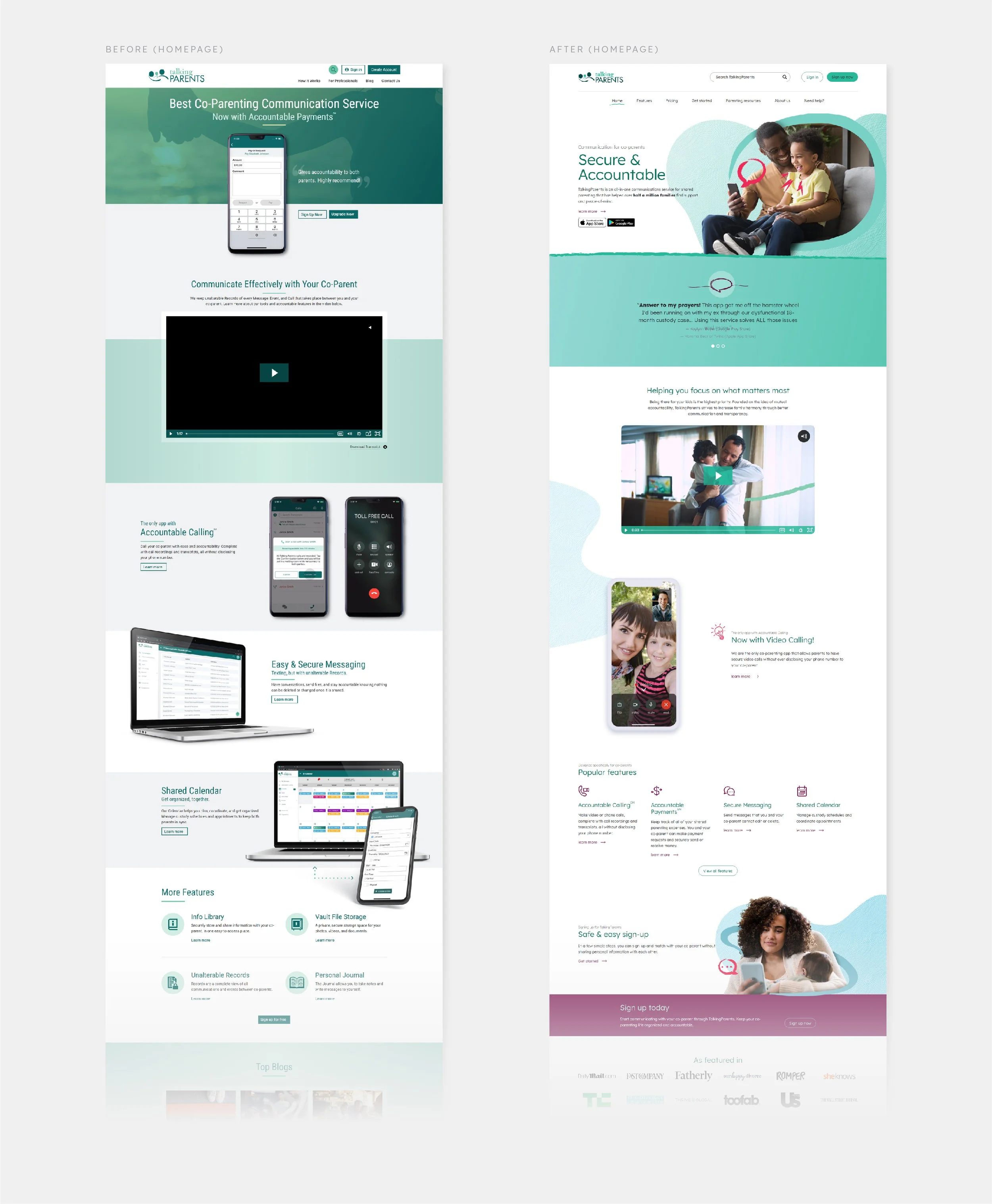
In addition to the perceptions around company ownership, the previous branding lacked almost entirely any imagery or video of people. Instead, the website and marketing materials were filled with device mockups and screenshots. This contributed to many users seeing the brand as calloused and impersonal.
Clarity
The card sorting demonstrated the disconnect between the previous site structure and how users organized it. We realized we would need to reformat the site structure and provide more straightforward naming conventions to help guide users through their discovery of the platform.
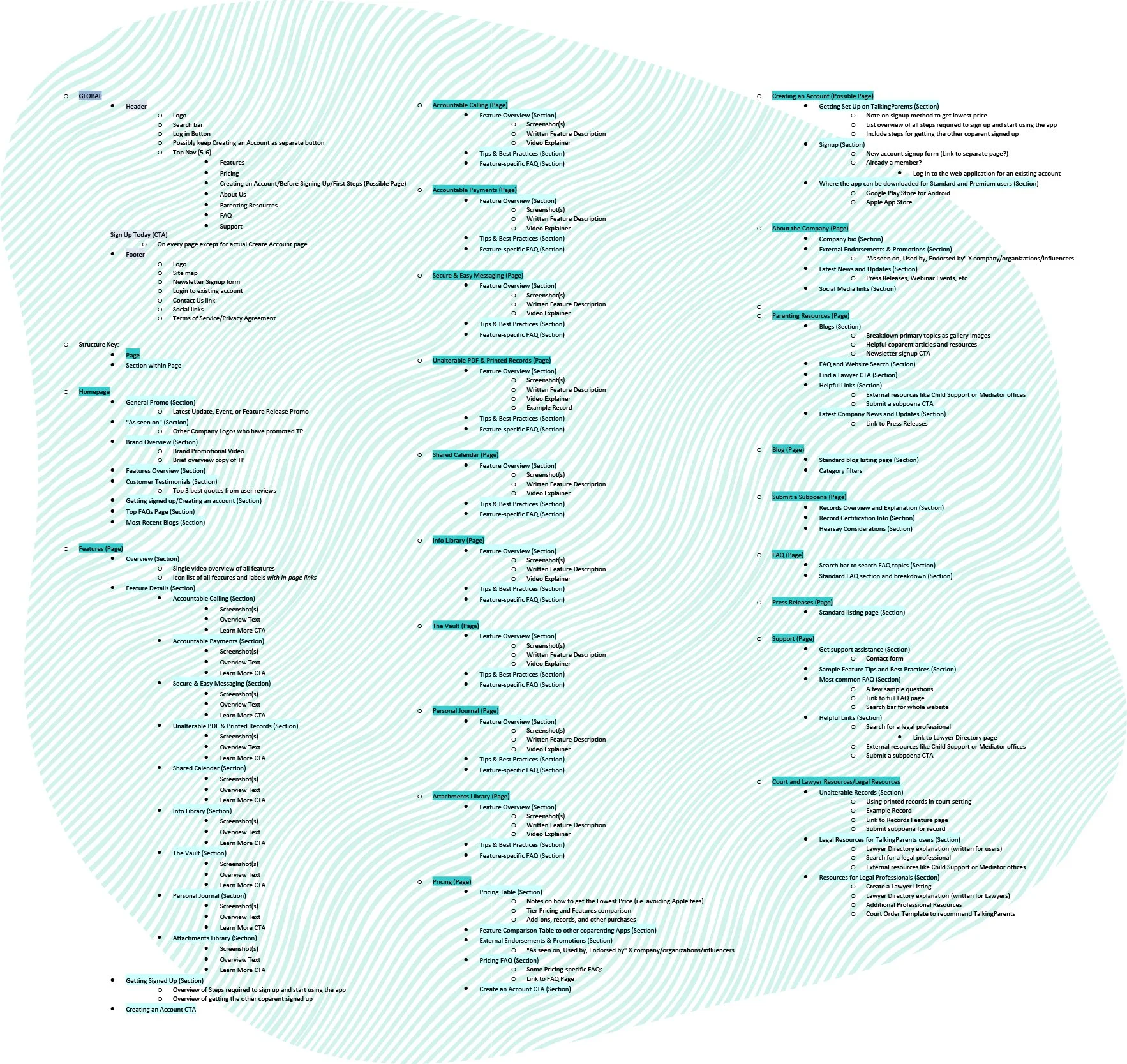
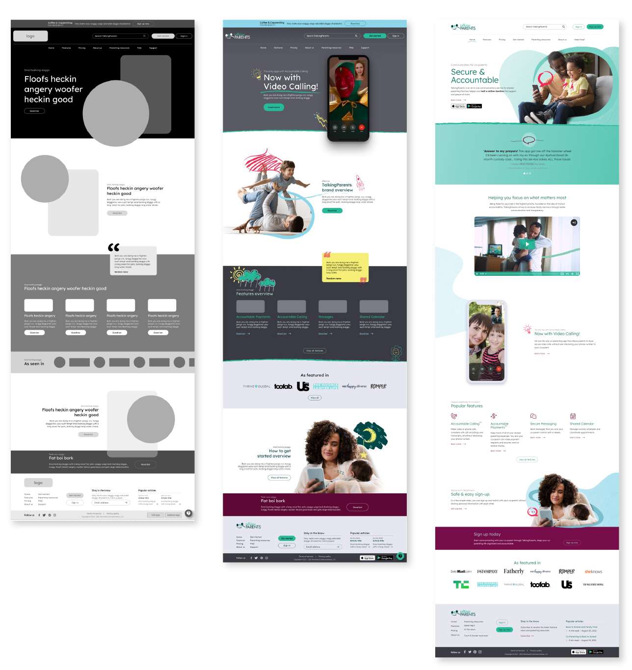
Information Architecture Design
Using the available data, I began crafting the new site architecture. This outline detailed all the content sections and was instrumental as the front-end developers began building wireframes and low-fi mockups.
The data analysis prompted us to implement a new "Get started" page to address the sign-up process, which was a point of confusion. The research also led to us rebranding the blog section as "Parenting resources." This more descriptive name improved clarity and encouraged users to explore these articles by implying a greater sense of value. We also renamed the contact page to "Need help?" which better communicated the intent of that site area.

Copywriting & Terminology
I collaborated with the Customer Experience and Digital Marketing teams to craft all site copy. The former provided invaluable insight into the additional pains and "triggers" for many parents in contentious relationships with their co-parents. I helped prepare and maintain an extensive terminology library, identifying all words we wanted to avoid and their substitutes, as well as the official formatting for proper nouns.
We then generated new site copy that spoke to the uplifting and approachable tone we wanted to portray to visitors. Our goal during this process was to frame TalkingParents as an advocate for co-parents who could help improve their situation. I owned a significant amount of copywriting, particularly surrounding the individual features and their benefits to users' lives.
Project Management & Art Direction
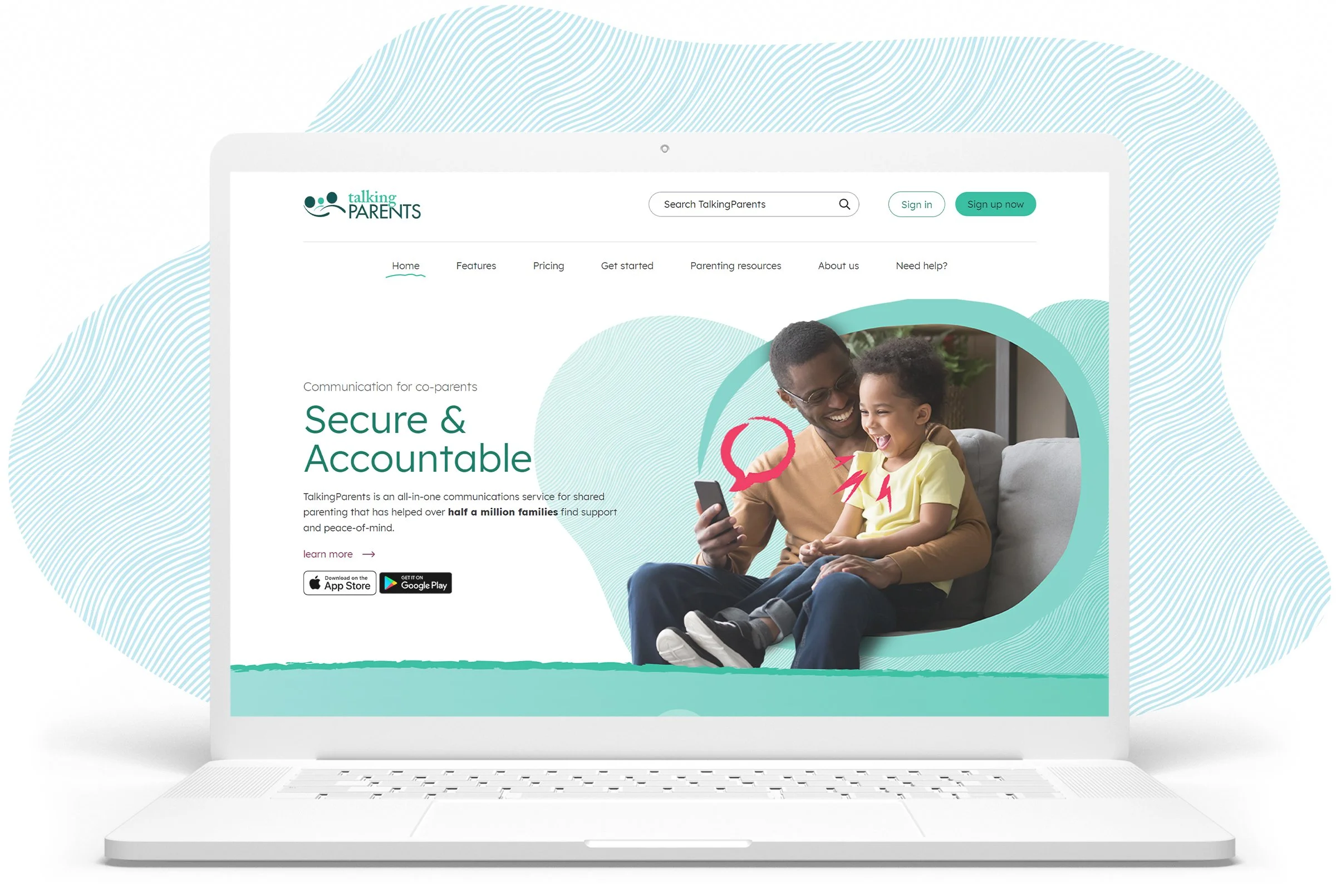
I led a team of designers to craft a complementary visual style to the new brand personality. One of our first changes was to expand the brand colors. The previous color palette was limited and consisted solely of monochromatic teal colors, which seemed cold and lifeless. We recognized that the visual tone would improve by incorporating additional colors such as light blues to promote calmness, warm purples and light yellows for friendliness, and minor splashes of deep magenta to call attention to any actions.


Our team explored the new artistic style concepts before landing on a "child-like doodle" theme. This theme afforded numerous advantages. It allowed us flexibility when illustrating app features; it promoted a friendly, approachable personality; and most importantly, it helped tie in the importance of children in the co-parenting process—something that was sorely missing from the previous branding.
I guided the designers to incorporate the doodles into our imagery by developing some essential rules:

The doodles must be contextual to the copy and imagery. They must illustrate the feature and benefits we are describing and fit thematically with the associated photo.

Doodles should be incorporated within the world of the family, flowing around and interacting with the parents and children.

The most prominent lines should visually point to the device itself, subtly bringing attention back to the app as a solution for co-parenting woes.

Website Development Consultation
I collaborated with the software engineer and marketing teams to ensure continuity of vision between the two departments. I served as a central point of review and guidance at all stages of the web development process, providing feedback for all the wireframes and mockups built by our front-end team.
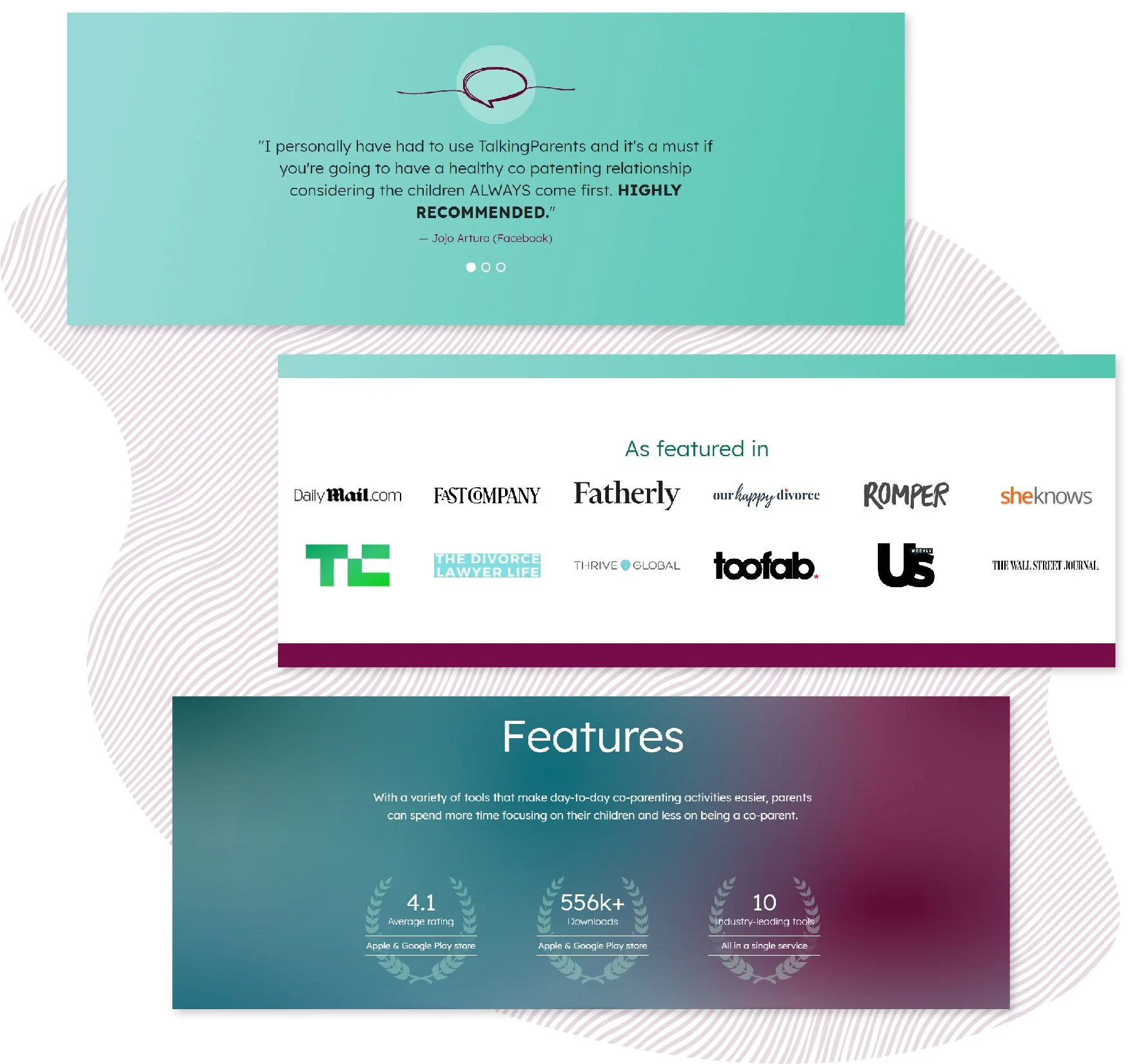
As our teams designed the new site, we incorporated new sections based on the user data and the information architecture I developed. For example, we included testimonials from user reviews, brand accolades, and an "as featured in" section to promote trust and highlight external validation from users and other well-known brands.
I collaborated with the design and development teams to define the high-level rules for the new graphics based on the brand's needs.

We would drastically reduce the heavy use of screenshots on phone and laptop mockups as this placed too much emphasis on the technology rather than the benefit it brings to co-parents' lives.

We would strictly avoid skeuomorphic mockups whenever screenshots are necessary, opting for simple frames with reduced details. This change would help prevent the brand from being perceived as too focused on tech.

We needed to incorporate actual human faces into the design. We would rely primarily on images and videos of parents with their children to break away from the perception of being an impersonal, government-owned service.
User Accessibility
Additionally, we improved site accessibility by ensuring all colors were ADA compliant, something the previous site did not address. To improve clarity further, I promoted "Lexend" to my team for the new brand typeface, which has been documented to enhance legibility and reading proficiency.

Results
We implemented these changes along with many other customer experience improvements, including an entirely new support workflow, an influencer-heavy social media strategy, and new premiere features.
These updates have kept TalkingParents one of the most highly rated co-parenting apps with a 4.4 rating on the Apple App Store. The website has experienced a 10% increase in year-over-year traffic, and the social media platforms have seen a drastic increase in positive responses and feedback.