
Half-Cent Referendum
Branding, UX, & Marketing
Summary
As Lead Digital Marketing Specialist at Bit-Wizards, I led the creative for School Cents Makes Sense, a 2020 campaign asking Okaloosa County voters to approve a half-cent sales tax for school repairs. I directed a team of four and built one creative system that ran across every medium a local race touches, from billboards and mailers to the website and paid social. I also wrote, animated, and voiced the campaign's explainer video on my own time. The referendum sat last on a presidential-year ballot, in a county where registered Republicans outnumbered Democrats nearly three to one. It passed with 56% of the vote and won three ADDY awards. Since then, the tax has powered a $218 million building program across every school in the district, including new roofs, new classrooms, 91 new school buses, and the district's first new school since 2008.
Details
Agency: Bit-Wizards (pro bono, a $250,000 investment in the campaign by the firm's own accounting)
Client: School Cents Makes Sense PAC, for Okaloosa County schools
Role: Lead Digital Marketing Specialist, creative lead for the campaign
Timeline: January–November 2020
Team I directed: Two graphic designers, a videographer, and a digital marketing specialist
Skills: Creative direction, art direction, campaign and messaging strategy, team leadership, brand identity, copywriting, UX and information architecture, data visualization, motion and video, print and digital advertising
Tools: Illustrator, InDesign, Photoshop, Adobe XD, After Effects, Adobe Draw, Logic Pro X, Facebook Ads
Context
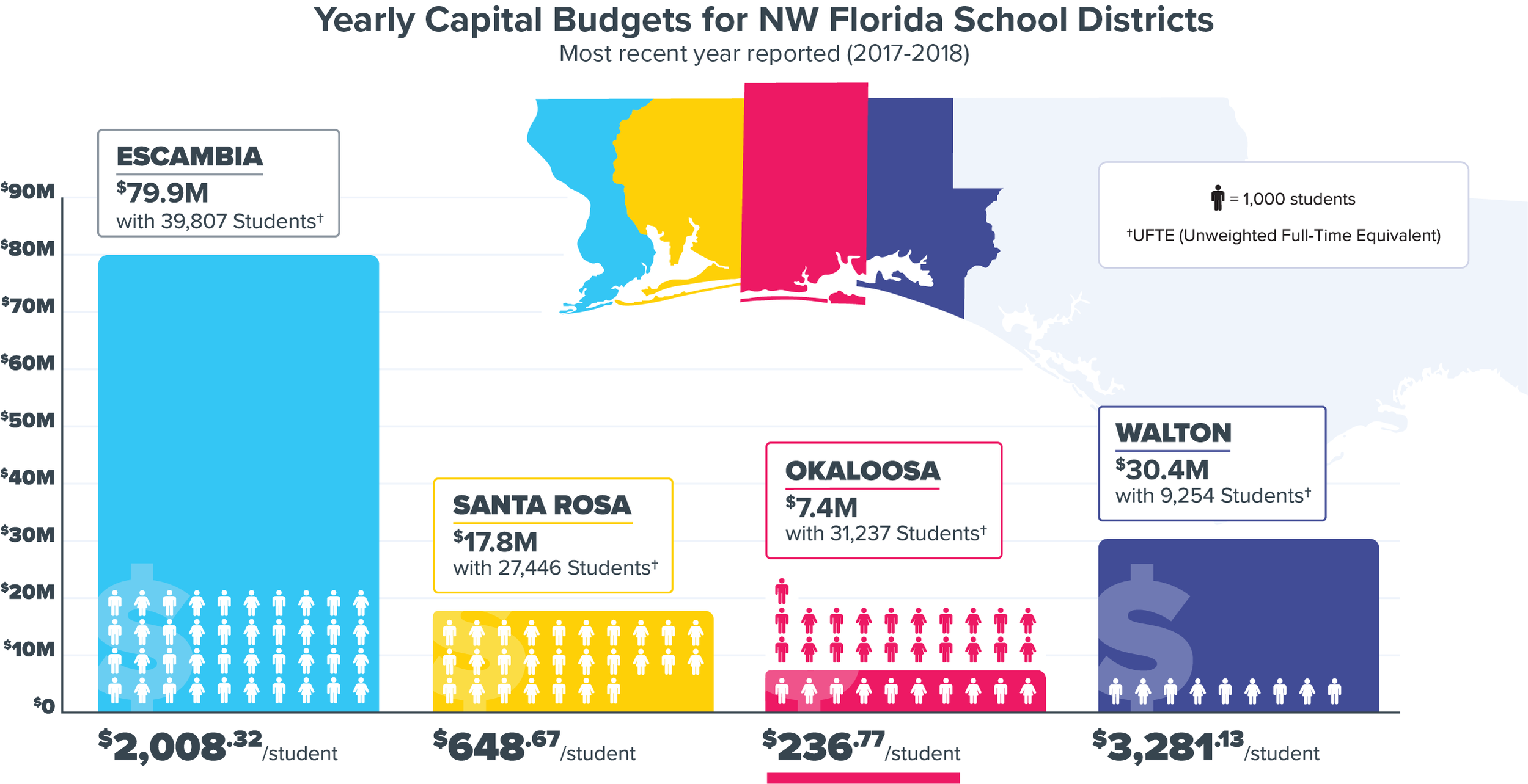
In 2020, Okaloosa County asked voters to approve a half-cent sales tax to fix school buildings the district had put off for decades. That meant leaking roofs, failing air conditioning, aging portable classrooms, security upgrades, an old bus fleet, and outdated technology. The district faced roughly $500 million in facility needs. Yet it was one of only a handful of Florida counties with no dedicated local tax for its schools. School Cents Makes Sense was the campaign to pass the fix.
My agency, Bit-Wizards, took on the whole effort pro bono. Our leadership was deeply involved in the community and the local Chamber, and they wanted better schools. I was pulled in to design one thing: a logo. They liked the work and came back for more, and kept coming back, until I was leading the creative for the entire campaign. From there, I owned it from the January launch through election night.
The Problem
Nothing about the environment was in our favor.
Local reputation. The school district had been bruised by well-publicized, unrelated controversies around former officials. Many residents also didn't understand how the money could and couldn't be spent.
Economic worry. COVID-19 had made people wary of any new tax. A spring of emergency online learning also left some voters doubting that school buildings were worth the investment.
Ballot fatigue. We were competing for attention inside a presidential election. The referendum sat dead last, as the 20th item on the ballot, where fatigue does the opposition's work for it.
A hard electorate. Registered Republicans outnumbered Democrats nearly three to one, and we were asking voters to say yes to new spending.
An organized opposition. A rival PAC spent some $180,000 to defeat the tax. It ran its own videos and yard signs across the county and seeded doubt about how the district managed money right up to election day. The campaign's advocates publicly called it a "vengeance campaign" in the local paper.
The problem was never any single obstacle. It was all of them at once, shifting month to month. The campaign had to be coherent enough to hold together and nimble enough to respond.
Research & Discovery
Before designing anything for voters, I needed to understand who we were persuading and what stood in the way.
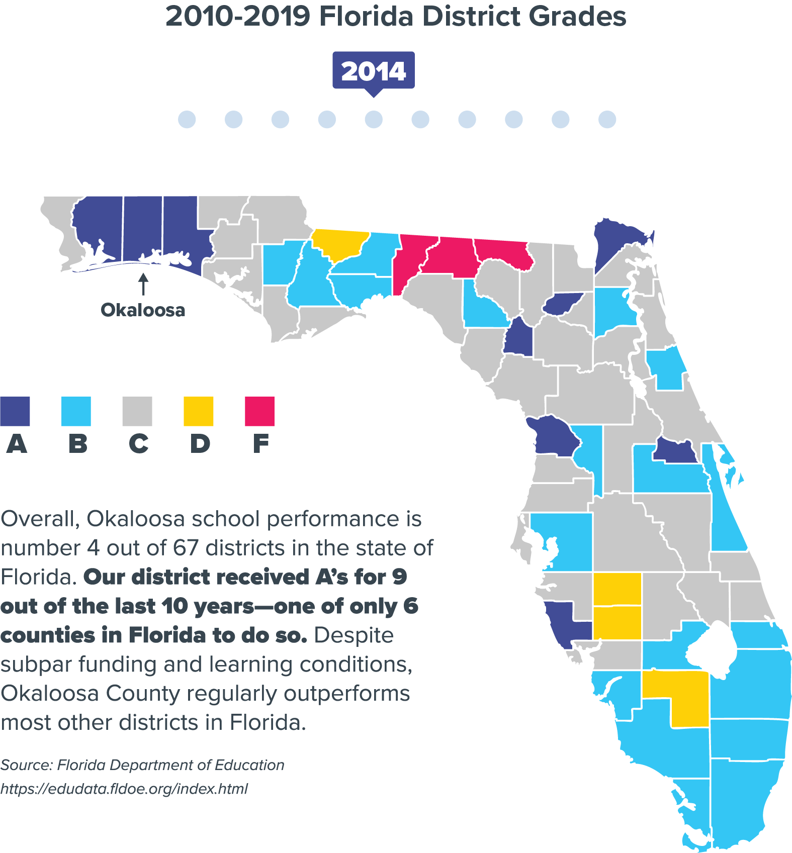
Where the parties split. On most education issues, Republicans and Democrats aren't far apart. School spending is the exception. According to the Brookings Institution, nearly three-fourths of Democrats favor more spending on public schools, while 54% of Republicans oppose it. In our county, that meant the campaign had to speak mostly to conservative voters.
What people misunderstood. Many residents had misconceptions about what the tax would pay for. The business leaders backing the campaign had already identified the myths the messaging needed to counter.
What the opposition was saying. The rival PAC's argument was about trust: could the district be trusted with the money? Our materials had to answer that doubt with clear, checkable facts.
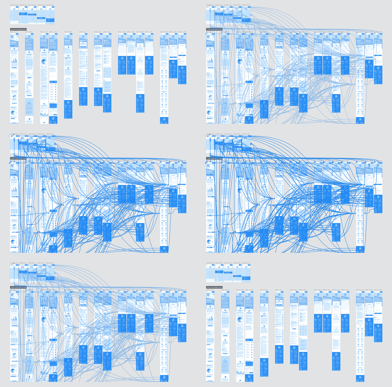
How people would look for answers. I ran a card sort to understand how people would group the campaign's information, and used it to shape the website's structure. It was my first real step into UX practice.
That research led to the campaign's central decision. Rather than argue policy, the creative would make an emotional, student-centered case: warm, optimistic, and unmistakably about kids and their schools. Then, for anyone who wanted the details, the facts would be easy to find and easy to follow.
Process & Approach
Leading the team
I owned every creative decision on the campaign and was responsible for how it all came out. I set the visual and verbal system, defined how it would work in every medium, and directed the team that produced it. The goal was that a billboard glimpsed at 60 mph and a 15-second video would read as unmistakably the same campaign. My department director helped when needed, but she left the creative direction for me to manage.
I directed a four-person team: two graphic designers, a videographer, and a digital marketing specialist. I set the style, art-directed their work, and reviewed everything to keep it consistent across a fast-moving, ten-month campaign. Development sat in a separate department, so I worked side by side with their project manager every day to get the design built the way it was meant to be.
I was also hands-on with the message. I helped write the copy and shape the marketing and messaging strategy, working with stakeholders on the hard question underneath the design: how do you sell a tax increase to voters primed to reject one?
An identity built to stand out
The PAC's original logo couldn't carry an emotional argument, so I rebuilt the identity from scratch. I sketched nine logo concepts on iPad, refined three in Illustrator, and guided stakeholders to the final choice. Before a single asset was produced, I developed three complete stylescapes to set the direction.
The chosen direction used clouds, sun rays, and rounded arrows for an uplifting, forward-looking feel. Its vibrant, high-contrast colors were chosen to stand out in a sea of political advertising.
Two jobs on every surface
The name and the call to action competed for the same space. The PAC had already chosen the name School Cents Makes Sense, which by design said nothing about voting. But a logo doesn't win an election.
So every piece had to do two jobs at once. It had to drive an unmistakable VOTE YES in the moment. It also had to build a brand that would outlast the election, because voters weren't approving a one-time expense. They'd be funding this for ten years, and they needed to connect the tax they paid to the schools it fixed. That's why every asset pairs a bold call to action with a lasting identity. It's also why the brand still does work today, on "funded by the Half-Cent Sales Tax" signs around the county.
Making the numbers clear
The funding case was dense and technical, and the opposition was actively working to distort it. That's exactly the kind of thing that loses referendums.
First, I created custom data visualizations that made the numbers easy to follow on the website, on social media, and in a printable infographic. Our social posts answered the questions voters were actually asking: how old and run-down the schools were, how our funding compared to other counties, what the money could and couldn't buy, and when and how to vote.
Second, the campaign needed one asset that carried the whole argument in one place. So I built an animated explainer video on my own time. I wrote the script, animated it, recorded the voiceover in my home studio, and mixed the music. It went on to win a Silver ADDY.
The website
Using what I learned from the card sort, I organized the campaign's sprawling information into a clear structure, built the wireframes and content in Adobe XD, and designed high-fidelity mockups. Then I worked closely with the development project manager to get it built as designed, with the user experience intact.
Every medium, one system
The campaign ran across billboards, yard signs, large canvas signs, a full-page newspaper ad, a direct mailer to every registered voter in the county, postcards, letterhead, flyers, a Facebook presence, and emails to Chamber members, parents, and volunteers. I also built and managed the paid social campaign. I directed the team producing all of it and designed much of it myself.
As the opposition pushed its message, we kept adjusting ours right up to election day. The point was never the volume. It was that everything, across ten months and a dozen formats, pulled in the same direction.
Impact
On November 3, the referendum passed with 56% of the vote, 62,653 to 50,140. It did that as the last item on the ballot, in a county where registered Republicans outnumbered Democrats nearly three to one. We thanked voters with "Thank You" billboards across the county.
"Tonight we gained a victory for the students and employees of the Okaloosa County School District. The Half Cent Sales Tax will serve our School District well."
— Superintendent Marcus Chambers, election night
The paid media performed well past benchmark:
Traffic ads reached 18,377 people at click-through rates of 4.36–5.41%. The average for Facebook ads across all industries is 0.90%.
The explainer video drew nearly 10,000 full views (ThruPlays) from 14,000+ impressions, roughly 70%.
The work earned three ADDY awards: Gold and a Judges' Choice for the campaign, and Silver for the video. It also earned the Fort Walton Beach Chamber's "Teddy" Award.
The part that outlasts the awards is that the money is still building schools. The tax runs through 2030. As of October 2026, the district's public dashboard shows a $218 million building program spread across 37 school sites. More than $158 million of that work is already done and paid for, and every site on the list has completed work. Collections have also run ahead of projections. By late 2023, the tax had raised $32.3 million more than expected.
Some of what the tax has helped fund so far:
Roofs and air conditioning. Roof, HVAC, plumbing, and accessibility repairs came first. The superintendent said the district was replacing roofs "at multiple schools for the first time in forever."
New classrooms. Additions at Elliott Point, Laurel Hill, Silver Sands, Crestview High, and Baker, plus a new wing at Destin Elementary designed to replace its portable classrooms.
Safer campuses. Secured single entry points and new perimeter fencing.
91 new school buses, a $12 million investment.
A new school. Pineview School in Crestview opened in August 2026, made possible in part by the tax. It's the district's first new school since 2008, with room for 1,200 students.
A nine-member citizens' committee reviews the spending in public meetings, and Bit-Wizards is still named among the district's community partners.
"It's been a game changer for this school district. Without it, what we're looking at right now wouldn't have happened."
— Superintendent Marcus Chambers, 2023
Sources
The campaign and the election
Northwest Florida Daily News (Tom McLaughlin): Okaloosa half-cent sales tax advocates for schools call out opposition (Oct 26, 2020)
Vince Mayfield, Bit-Wizards CEO: October letter to the FWB Chamber (Oct 7, 2020)
Brookings Institution (Michael B. Henderson): How far apart are Democrats and Republicans on school reform? (Aug 3, 2015)
Life Media Group: Bit-Wizards: Making It So ($250,000 figure)
Get The Coast: Okaloosa County voters said Yes as the half-cent sales tax passes (Nov 3, 2020)
Northwest Florida Daily News (Tony Judnich): Voters approve Okaloosa County half-cent sales tax for schools (Nov 3, 2020)
WEAR ABC 3: Okaloosa County voters pass school board referendum half-cent sales tax (Nov 4, 2020)
What the tax has funded since
OCSD Sales Tax Capital Program dashboard (viewed October 2026)
Okaloosa County School District: Half-Cent & Capital Project Progress
Okaloosa County School District: Capital Improvement News & Announcements
Get The Coast: Half-cent sales tax oversight committee appointed (Jan 25, 2021)
Get The Coast: Okaloosa School District to begin $130 million in major district-wide construction projects (Dec 14, 2021)
WEAR ABC 3: Okaloosa County Schools seeing improvements from half-cent sales tax (Aug 10, 2023)
Get The Coast: Niceville area schools undergoing major upgrades thanks to Half-Cent Sales Tax Funding (Jan 30, 2024)
Get The Coast: Crestview High School unveils its new multipurpose building funded by half-cent sales tax (Sep 12, 2024)
Okaloosa County School District: Superintendent Marcus Chambers Reflects on a Strong First Semester (Feb 2026)
WEAR ABC 3: New Pineview K-8 School opens in Okaloosa County (Aug 14, 2026)
• • Get The Coast: Okaloosa School District cuts ribbon on new Pineview School in Crestview (Aug 17, 2026)
Reflection
What made this work wasn't any single asset. It was consistency: one creative system, held across ten months and every medium, in the middle of the loudest election in memory.
That's the part I'm proudest of. Not that we produced a lot, but that a whole team, pointed in one direction, moved a hard electorate to yes and left something standing behind it.
It was also where my UX work began. The card sort and site architecture I built for this campaign were my first real UX practice, years before product design became my full-time role.
Project Details
I served as project manager and primary designer for the School Cents Makes Sense marketing campaign. This campaign advocated for a referendum on the county’s November 2020 election ballot that, if passed, would implement a half-cent sales tax to benefit Okaloosa's school infrastructure needs.
My team needed to build and maintain a complete digital presence from the ground up. We collaborated with various stakeholders on messaging while I created the visual identity to educate voters on why they should vote "yes." I either created or was directly involved in nearly every aspect of this campaign.
Challenges
There were several significant challenges to overcome to promote this campaign successfully.
-
Public opinion concerning the local school district was mixed due to much-publicized yet unrelated issues regarding former elected officials, which led citizens to be less likely to vote for the needed funding. Many citizens also had misconceptions about how the funds would be used.
-
Recent economic hardships brought on by the COVID-19 pandemic added to the unease around additional taxes. For many, the temporary implementation of online learning also increased skepticism toward school infrastructure spending.
-
The 2020 Presidential election was a significant distraction to the local referendum, so we needed to drive continued awareness for the entire campaigning period, which kicked off in January and ended in early November. The referendum was the 20th and the last item on the ballot; therefore, my team needed to build enthusiasm for the referendum to combat ballot fatigue.
-
Party affiliation posed another precarious challenge. Some studies suggest that Republicans and Democrats tend to have similar levels of support for some education-related issues such as universal vouchers, raising teacher pay, merit pay, etc. However, the Brookings Institution states, "the biggest partisan gap here concerns spending... There are differences on other issues... but these differences hardly pit the parties in opposing corners of the ring. In only one case does the majority from one party oppose the majority from the other. Nearly three-fourths of Democrats favor more spending on public schools, and 54 percent of Republicans oppose it."
-
Moreover, a separate local political action committee was working in stark opposition to School Cents Makes Sense. This other PAC launched a rival campaign across the county, posting videos on social media and putting up yard signs to discourage voters from approving any additional school spending. My team would continue to pivot to combat this messaging up to election day.
My Contributions
Project Management
Marketing Strategy
Branding
Logo Development
Graphic Design (Print & Web)
Data Analysis & Visualization
Information Architecture Design
Prototyping & UX Design
Web Design
Copywriting
Scriptwriting
Video Editing
2D Animation
Voiceover Recording & Production
Digital & Print Advertising
Tools Used
Adobe InDesign
Adobe Photoshop
Adobe Draw
Adobe Illustrator
Adobe XD
Adobe After Effects
Logic Pro X
Facebook Ads
Outcomes
Successful Yes Vote
Gold ADDY Award (Political Campaign)
Silver ADDY Award (Online Video)
ADDY Judges Choice (Political Campaign)








Results
Election Results. On November 3, the Okaloosa County School Board referendum passed with 56% of the vote (62,653 to 50,140), making an exciting victory for myself, Bit-Wizards, and all who supported the School Cents Makes Sense campaign! We showed our appreciation to Okaloosa voters by posting “Thank You” billboards around the county.
Measurable Advertising Results. The campaign’s social media advertising saw positive results. The traffic-generation campaigns reached 18,377 people with click-through rates between 4.36% and 5.41%—fairly high compared to the 0.90% average click-through rate for Facebook ads across all industries. Additionally, a brief, separate ad ran to promote the explainer video I donated. Of the 14,000+ impressions, the video received nearly 10,000 ThruPlays—roughly 70% of all impressions.
Additional Recognition. This campaign and the accompanying video also won a total of four ADDY awards. My team and I were also publicly recognized by the Fort Walton Beach Chamber for our work.
